Illustration & Design
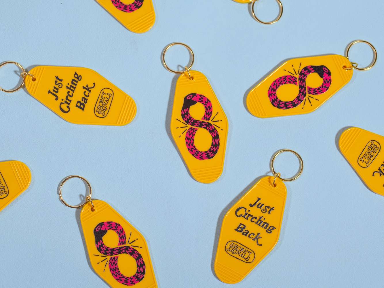
Secret Signals Chinese New Year Merch
Illustration – Merch Design
I illustrated a set of merch designs for Secret Signals’ Year of the Snake corporate gift, creating artwork that reflects the company’s quirky, edgy personality as a music artist management brand. The collection featured an ouroboros snake for a motel-style keychain, and a pair of intertwined snakes forming the initials “SS” for a custom leather tray. Designed to be bold, playful, and highly usable, the illustrations helped turn the corporate gift into something recipients would genuinely enjoy keeping.
more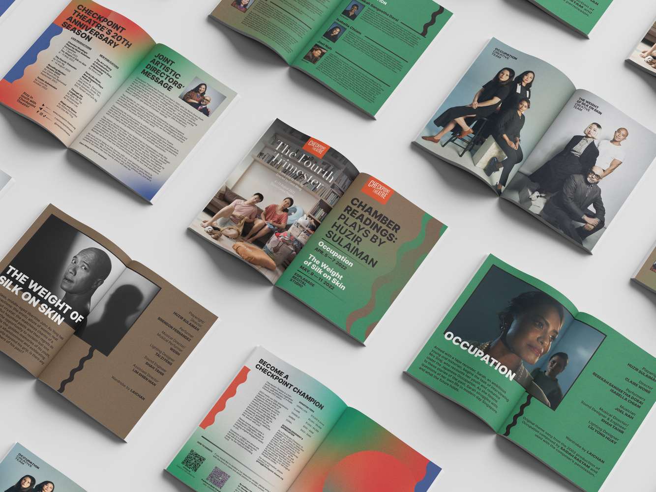
Chamber Readings Programme Booklet
Graphic Design – Publication Layout
I designed the programme booklet for Checkpoint Theatre’s Chamber Readings, creating the graphic elements and laying out the text and images to form a clear, cohesive visual narrative. The design highlights the intimacy and focus of the readings while maintaining Checkpoint Theatre’s refined aesthetic. The result is a thoughtfully structured booklet that supports both readability and artistic presentation.
more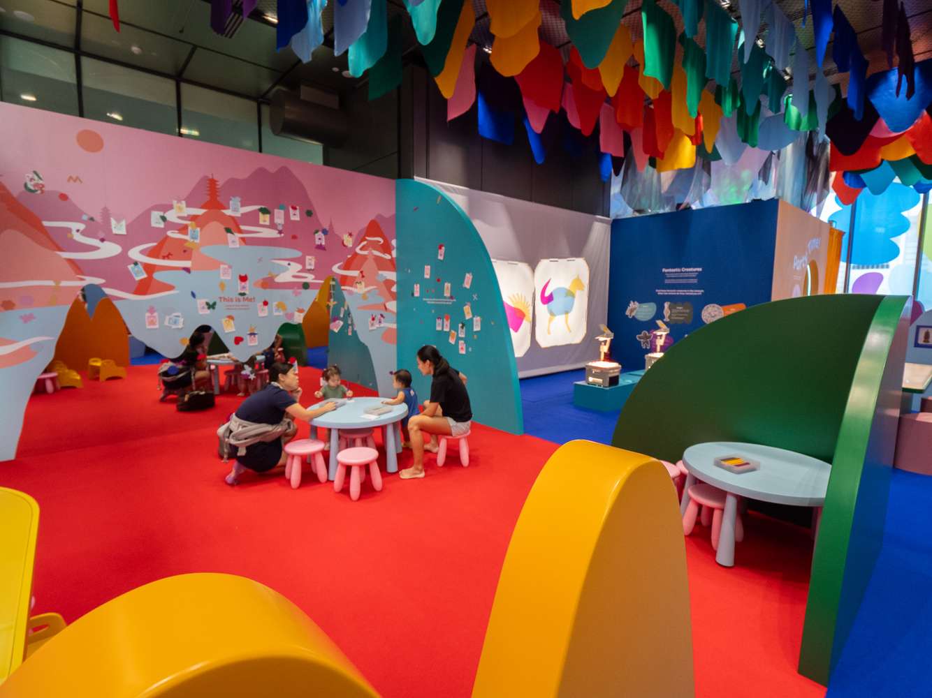
Asian Civilisations Museum: Children's Gallery
Spatial Design – Illustration – Graphic Design - Creative Direction
I designed Asian Civilisations Museum’s first Children’s Gallery from the ground up, serving as both art director and creative director for the entire project. Built around a playful motif derived from reducing the museum’s initials—ACM—into simple, engaging shapes, the gallery’s visual identity informed every aspect of the space. I developed the full spatial layout, custom-designed all furniture and interactive elements, and established the core colour palette. I also illustrated every graphic and designed all children’s activities found in the space. The result is an immersive, child-friendly environment that reimagines ACM’s identity in a fresh, accessible, and culturally engaging way.
more
Schanze Nozawa Branding
Logo Design – Illustration
I was commissioned to refresh the branding for Schanze Nozawa, a ski lodge in Nozawa, Japan, modernising its identity while preserving its sense of place. The rebrand included a redesigned logo with a cleaner, contemporary aesthetic, as well as a series of custom illustrations for merchandise that captured the lodge’s alpine charm and playful winter character. The updated visual identity brings new energy to the brand while remaining welcoming and true to its roots.
more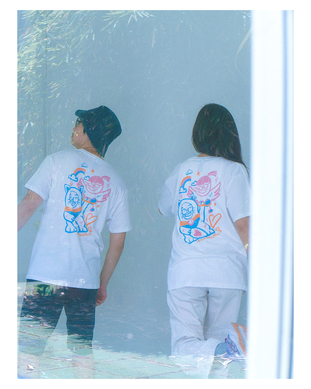
T-shirt Designs
Illustration – Art Direction – Photography
For Arterly Obsessed, I create all the t-shirt illustrations and designs in-house, developing concepts that reflect our studio’s playful, art-driven identity. From sketch to final artwork, I handle the full creative process, ensuring each design feels bold, thoughtful, and uniquely ours. Beyond illustration, I also art-direct and edit all our merch photo shoots, crafting visuals that capture the personality of the brand and showcase the products in a cohesive, engaging way. Every piece of merch becomes an extension of our studio ethos—fun, creative, and proudly artist-made.
more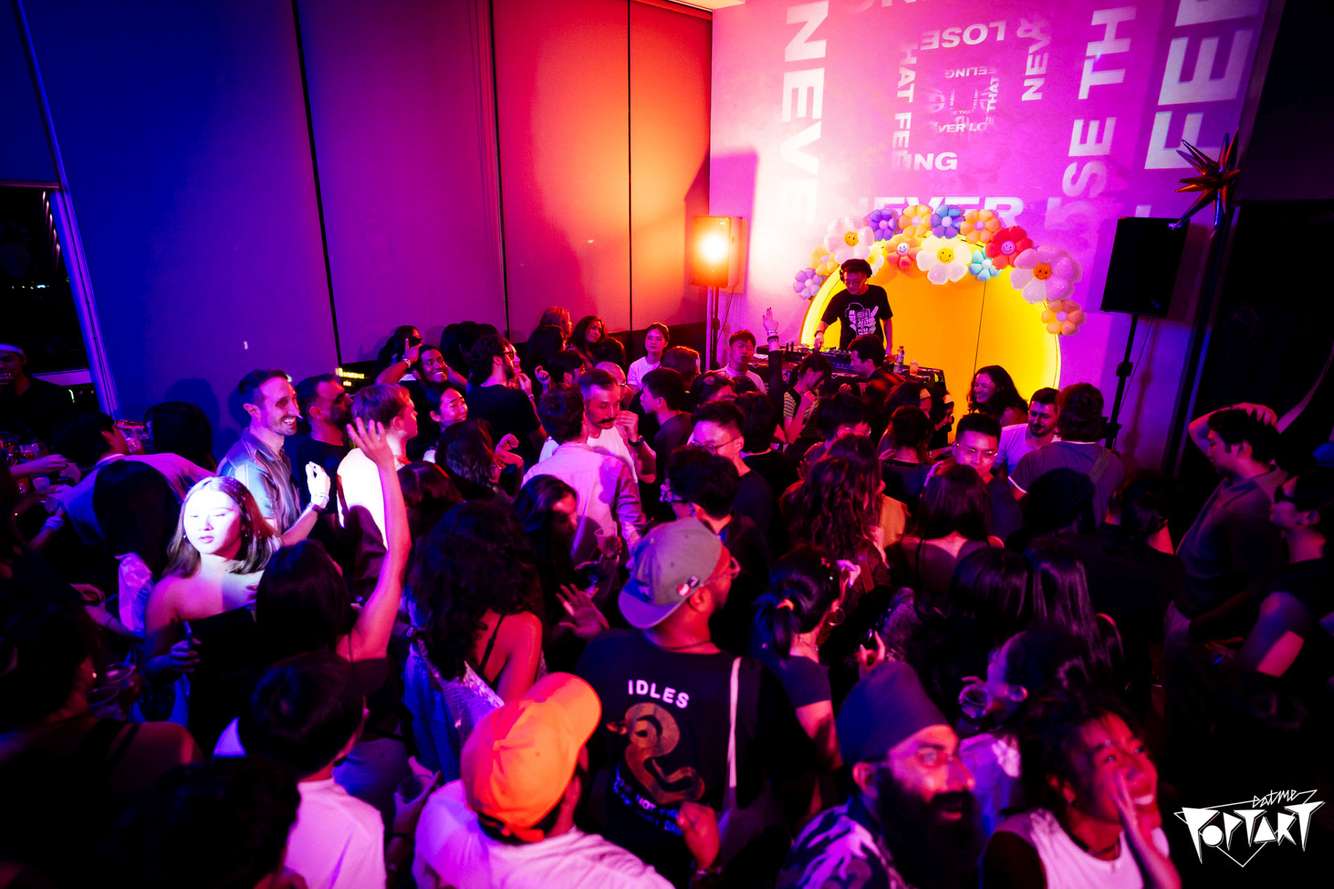
EATMEPOPTART
Illustration – Logo Design – Graphic Design – Motion Graphics Design
EATMEPOPTART is one of Singapore’s longest-running and most iconic indie-dance party collectives, known for its high-energy nights, eclectic music culture, and fiercely loyal following. I collaborated with the team to illustrate and design a series of their party posters, bringing their bold, playful identity to life through vibrant graphics and expressive character-driven visuals. My role included developing key illustrations and visuals, refining the overall aesthetic, and creating artwork that captured the electric, anything-goes spirit of the EATMEPOPTART experience.
more
2023 Singapore F1 Grand Prix Singapore Suite Mural
Illustration
I illustrated and designed a series of murals for the 2023 Singapore F1 Grand Prix – Singapore Suite, creating artworks that celebrated iconic local landmarks from Peranakan shophouses to the city skyline. The main mural was rendered in a nostalgic, pastel-infused palette inspired by Tiong Bahru Social Club, giving the space a distinctly Singaporean warmth. A feature staircase wall was co-created with fellow Singapore illustrator Priscilla Tey, where our styles were intentionally merged into a seamless collaborative artwork. I also art directed a pixel-based mural produced by SOTA students, ensuring visual cohesion across all mural installations on the floor.
more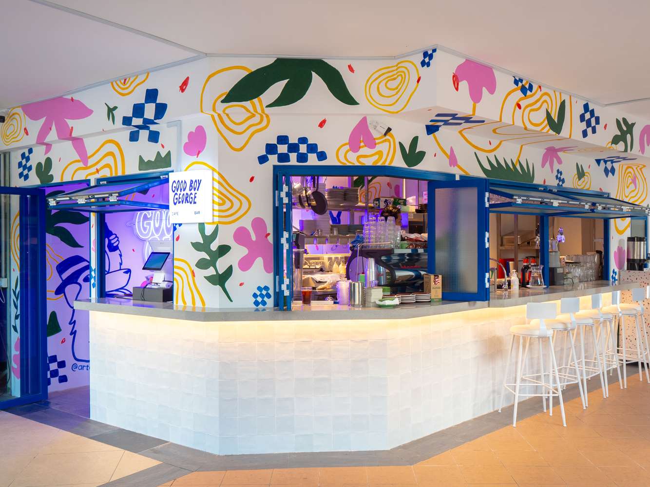
Good Boy George Branding
Brand Design – Mural Design – Graphic Design – Illustration – Social Media Management
I developed the full branding for Good Boy George, a pet-friendly café in Robertson Quay, creating a quirky and distinctive identity that stands out along the vibrant riverside stretch. The logo was inspired by George, the owners’ golden retriever and the café’s namesake, setting a playful tone carried through the visual system. Beyond the logo, I painted the in-store mural, designed merchandise, crafted the website and menu, and continue to manage the café’s social media presence. The result is a cohesive, character-driven brand that reflects the owners’ personality and the welcoming spirit of the space.
more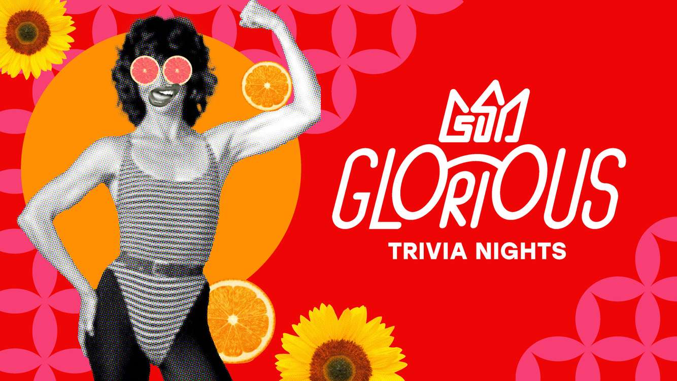
Glorious Trivia Branding
Brand Design
I was approached by Glorious Trivia, a company known for hosting lively trivia nights across various bars, to refresh their branding and give it a more refined, professional look while keeping their signature playful spirit. The owner wanted a custom logo featuring a crown that subtly incorporates the initials GTN, paired with a secondary logo mark that includes a quirky pair of glasses—an emblem of wit, curiosity, and clever fun. She also wanted the circle to be a main motif in the brand assets.
Drawing inspiration from pop art, the new identity is bold, colourful, and energetic, with a mix of clean shapes and graphic textures that make the brand instantly recognisable. Alongside the logos, I created a suite of adaptable visual assets that the client can easily use and customise on platforms like Canva. The result is a vibrant, modern brand system that captures the charm of Glorious Trivia while supporting its growth and visibility across venues.
more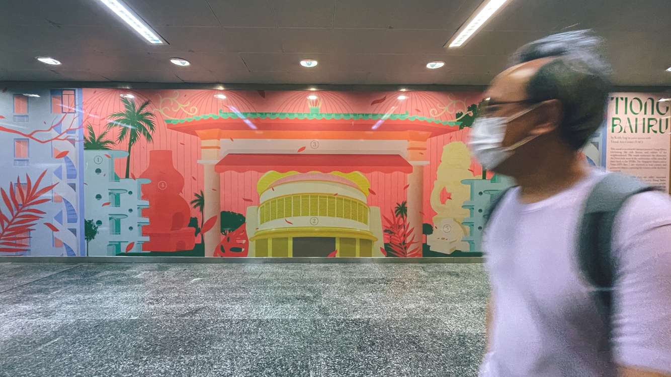
Tiong Bahru Train Station Mural
Illustration
I was commissioned by SMRT Singapore to illustrate a mural for Tiong Bahru Station, featuring iconic landmarks from the neighbourhood. Inspired by the visual style of the local film Tiong Bahru Social Club, I focused on using playful colours and simple geometric shapes to echo the movie’s distinctive aesthetic. The result is a vibrant, characterful mural that pays homage to both the film and the unique charm of Tiong Bahru.
more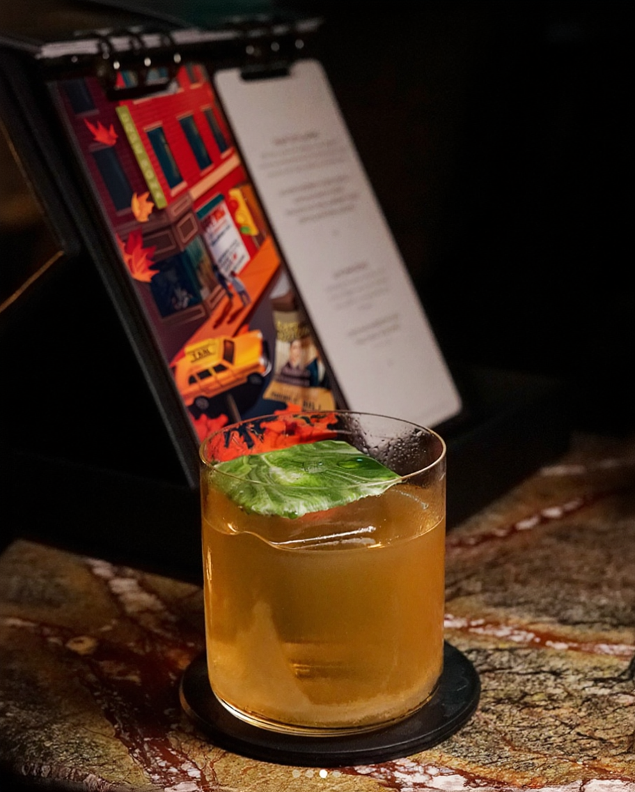
Manhattan Bar Seasons of Manhattan Cocktail Menu
Illustration
I illustrated a series of visuals for Manhattan Bar Singapore’s Seasons of Manhattan cocktail menu, creating digital artworks inspired by iconic New York scenes and the changing moods of the city. The illustrations were crafted to complement the storytelling behind each cocktail, blending atmospheric details with a sophisticated, contemporary style that reflects the bar’s award-winning identity.
more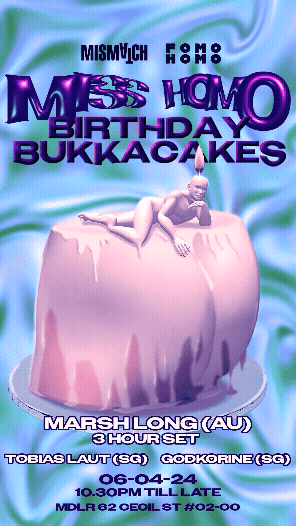
Miss Homo – 1st Anniversary Key Visuals
Illustration – Graphic Design
For Miss Homo’s first-anniversary party, I was commissioned to create the illustration and animation assets for their social media campaign. The event was titled “Birthday Bukkacakes”, and the brief called for visuals that captured the collective’s playful, cheeky queer energy while remaining fun, suggestive, and still safely PG for broader audiences.
more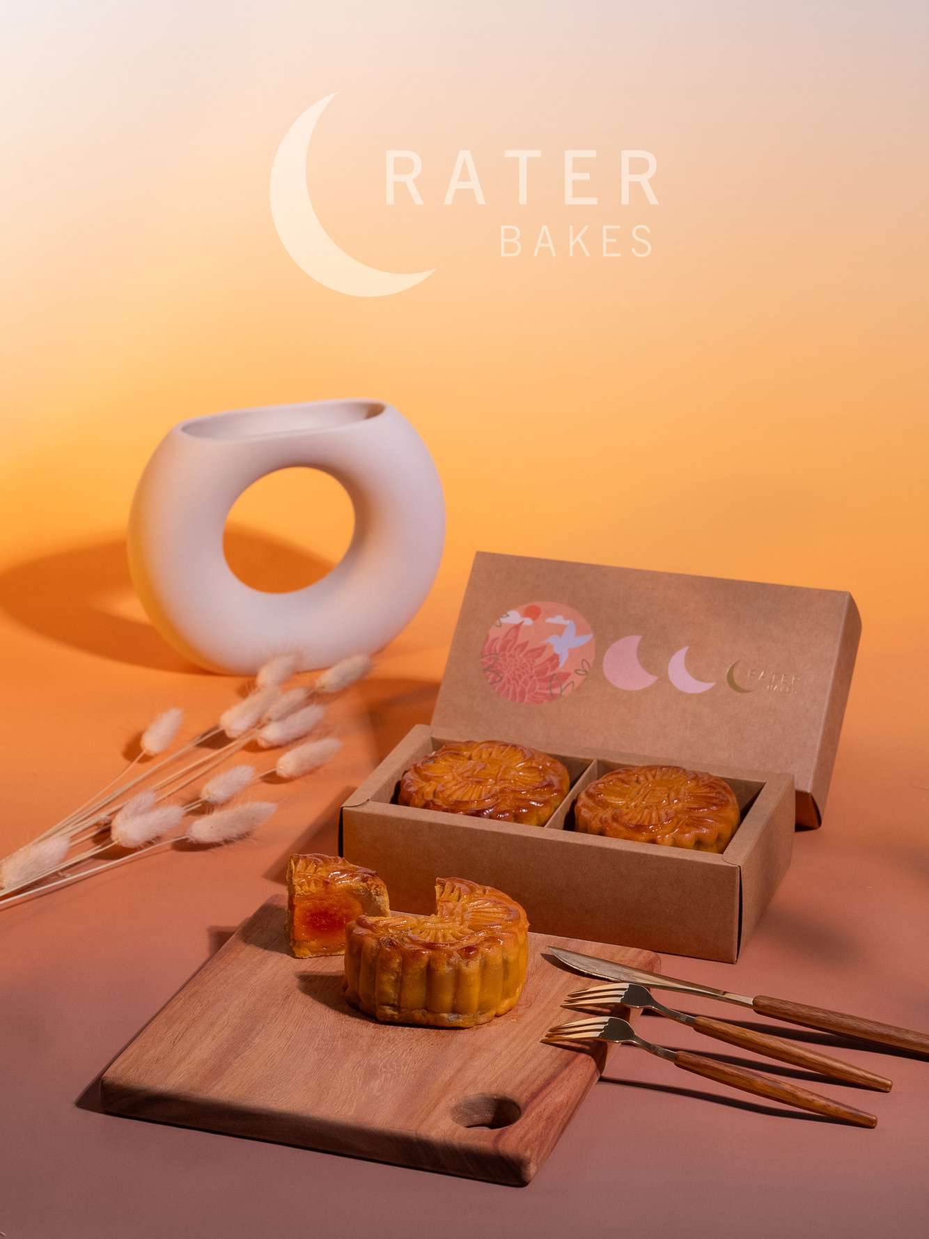
Crater Bakes Product Packaging and Campaign
Illustration – Packaging Design – Art Direction – Photography
I illustrated and designed the product packaging for Crater Bakes’ Mooncake Festival collection, creating a look that felt both classy and contemporary to appeal to customers young and old. Guided by the brand’s values of shared humanity, tradition, and holistic wellness, I illustrated a chrysanthemum to symbolise longevity and health, and a hummingbird to represent good luck and vitality. The phases of the moon were also woven into the design, culminating in the brand’s logo as a subtle narrative element. To support the client’s sustainability goals, the packaging was produced using recyclable materials. I also art directed the product photoshoot—developing the visual concept, styling the setup, and editing the final images to complete the brand presentation.
more
Changi Chapel Museum Book Illustrations
Illustration
I was commissioned to create a series of black-and-white war illustrations for the Singapore Changi Chapel Museum publication. Although produced digitally, the artworks were crafted to mimic the texture and sensitivity of graphite drawings, using deliberate contrasts of positive and negative space to evoke a quiet, haunting atmosphere. The illustrations aimed to honour the stories of the period with restraint, emotional depth, and visual poignancy.
more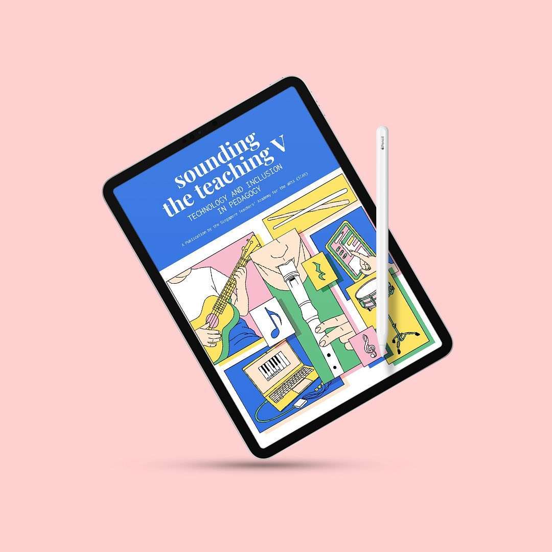
Sounding the Teaching V: Illustration and Layout
Illustration – Publication Layout
I worked with the Singapore Teachers’ Academy for the Arts (STAR) to design and illustrate Sounding the Teaching 5, a comprehensive 226-page music teaching resource book. For this project, I handled the full layout—from structuring the content and creating visual hierarchy to ensuring clarity and flow across chapters—while also producing custom illustrations to support and enliven the educational material. The result is a cohesive, engaging publication that balances functionality with visual appeal, designed to support music educators in the classroom.
more
ELIS e-Digest
Illustration – Publication Layout
I created a series of illustrations and page layouts for MOE ELIS’ e-Digest, designing visuals directly inspired by the publication’s featured content. Alongside the custom illustrations, I developed the overall page and typography layout to ensure clarity, readability, and a cohesive visual identity. The final deliverable included interactive PDF features, transforming the digest into an engaging and user-friendly digital publication for educators.
more