Sunbase
Sunbase required a brand identity and packaging system that could reposition sunscreen as an effortless, everyday essential, moving away from clinical or overly technical aesthetics towards a more lifestyle-driven, desirable product.
Constraints
The brand needed to communicate lightness, ease of use, and warmth while maintaining a sense of credibility within the skincare space. The identity had to work cohesively across packaging, product design, and campaign visuals, while appealing to a broad, gender-neutral audience. It also needed to balance a premium feel with accessibility, ensuring it could stand out on shelf without appearing overly luxurious or niche.
Decision & Rationale
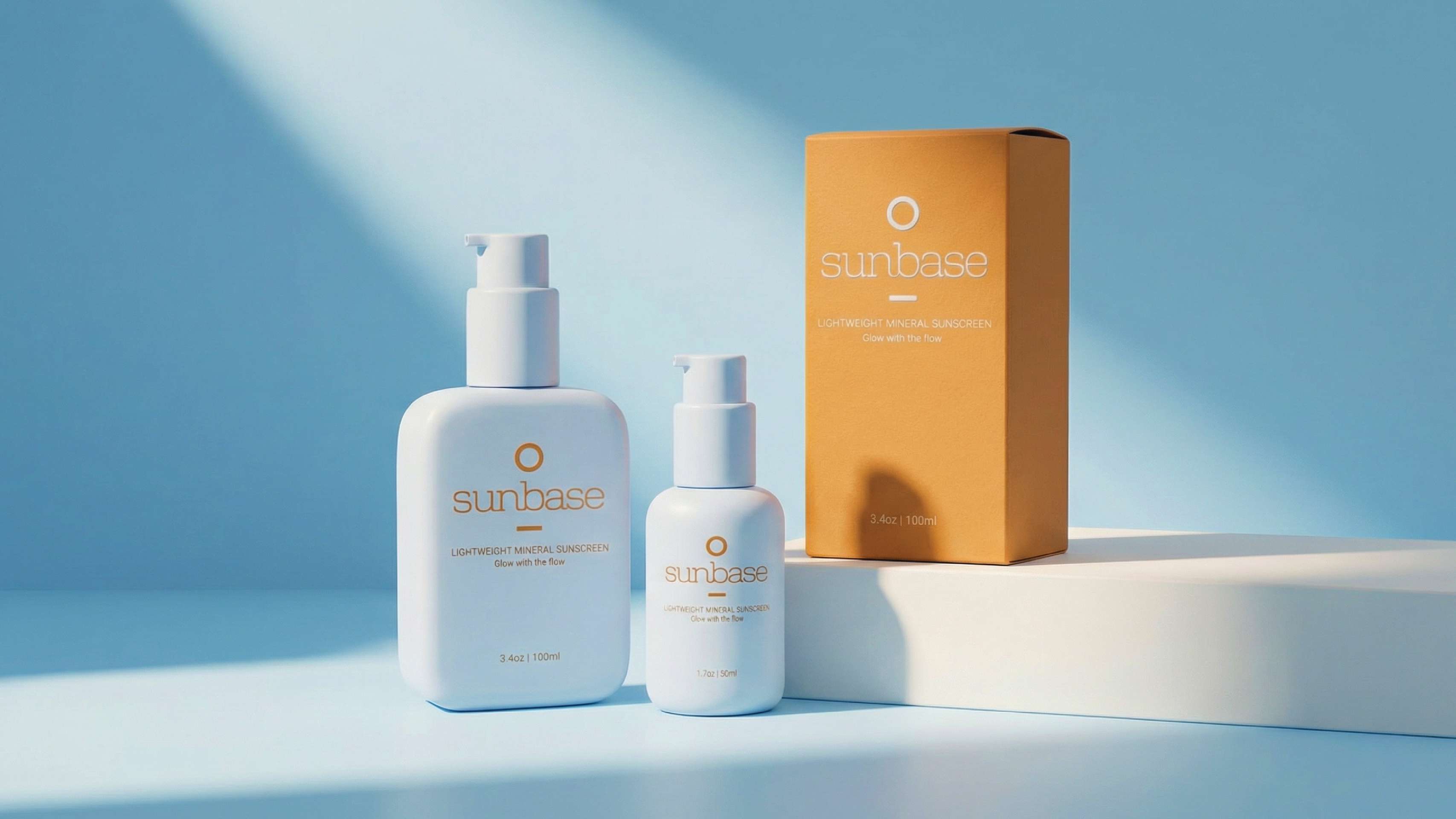
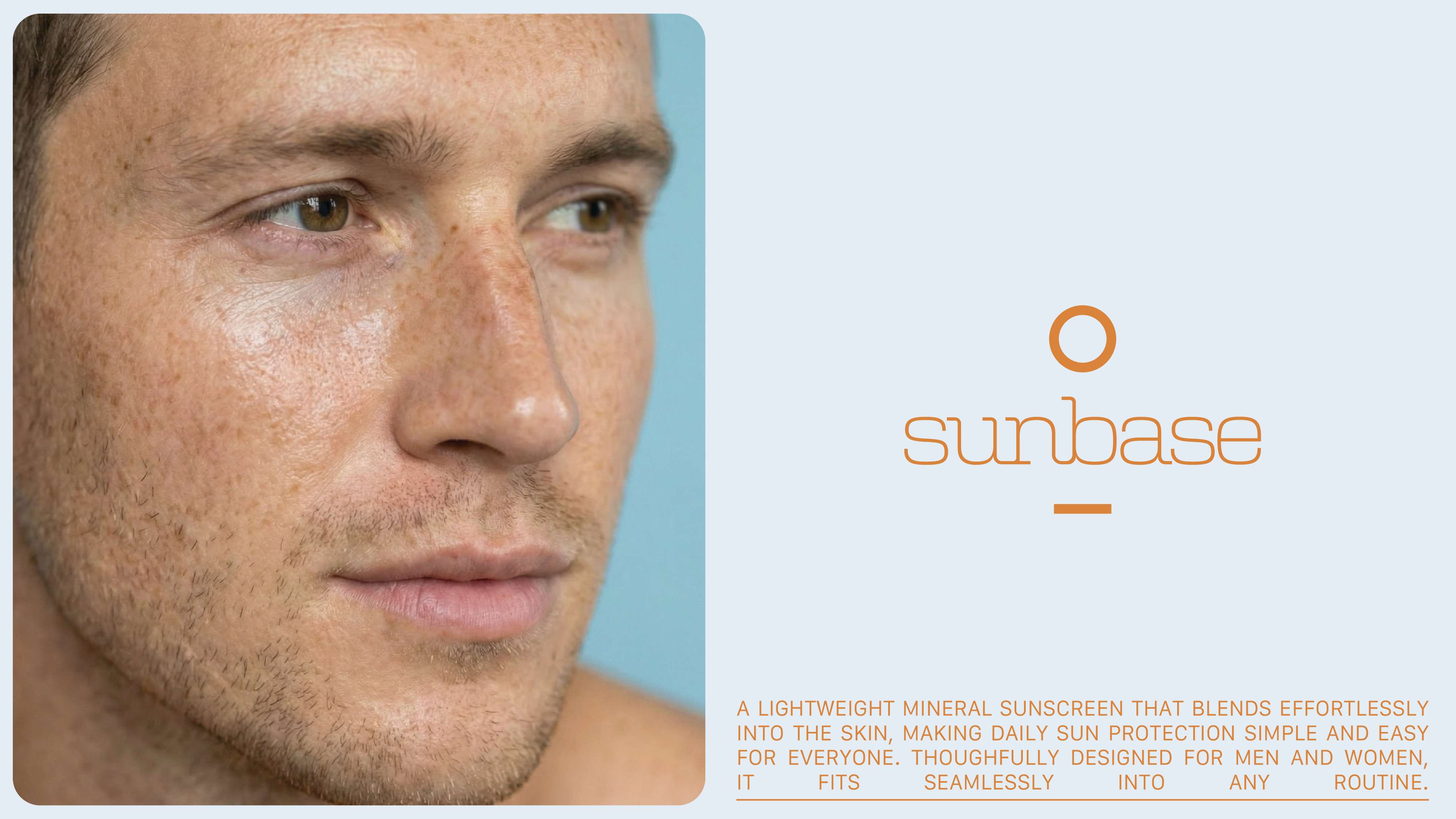
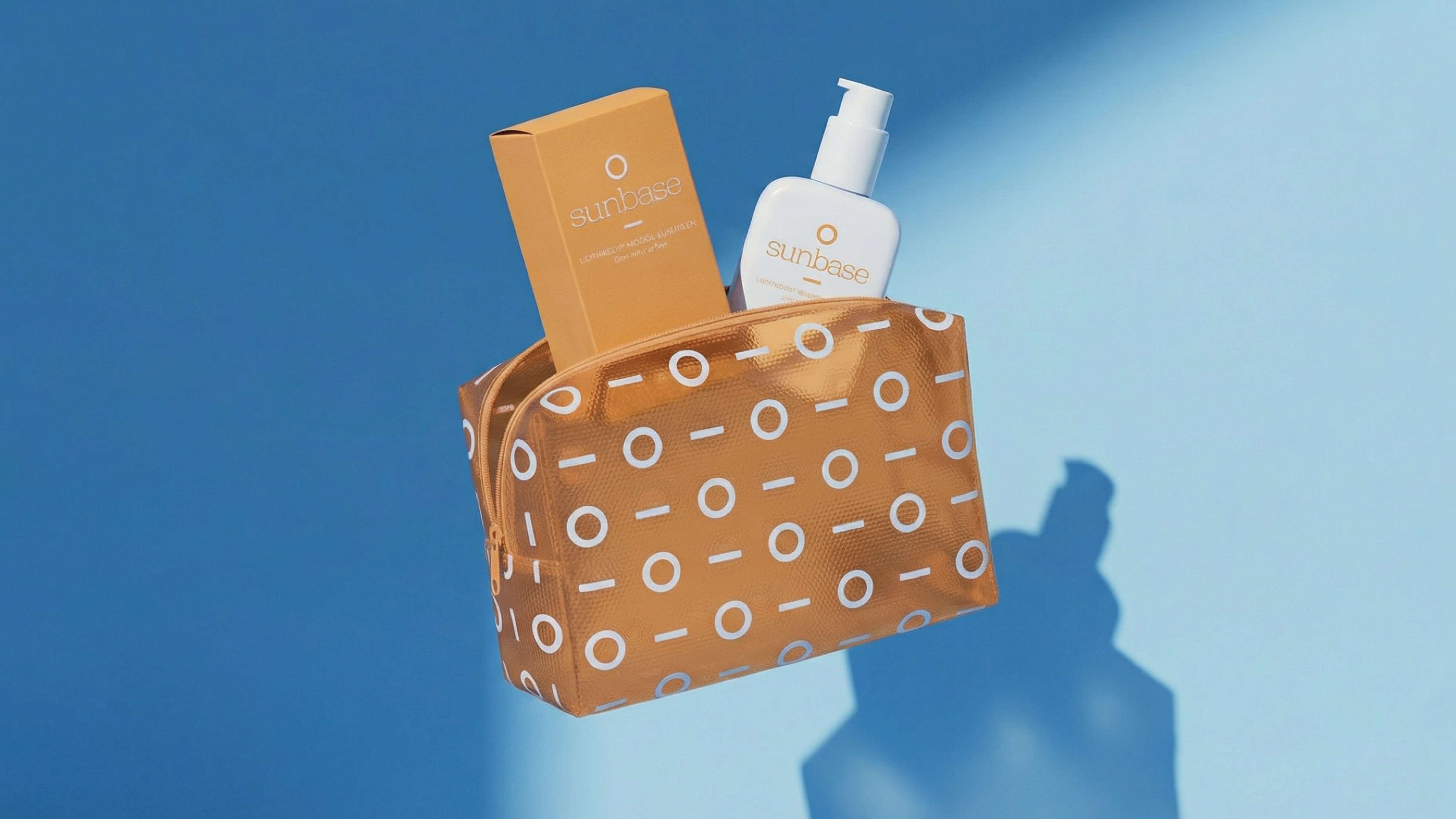
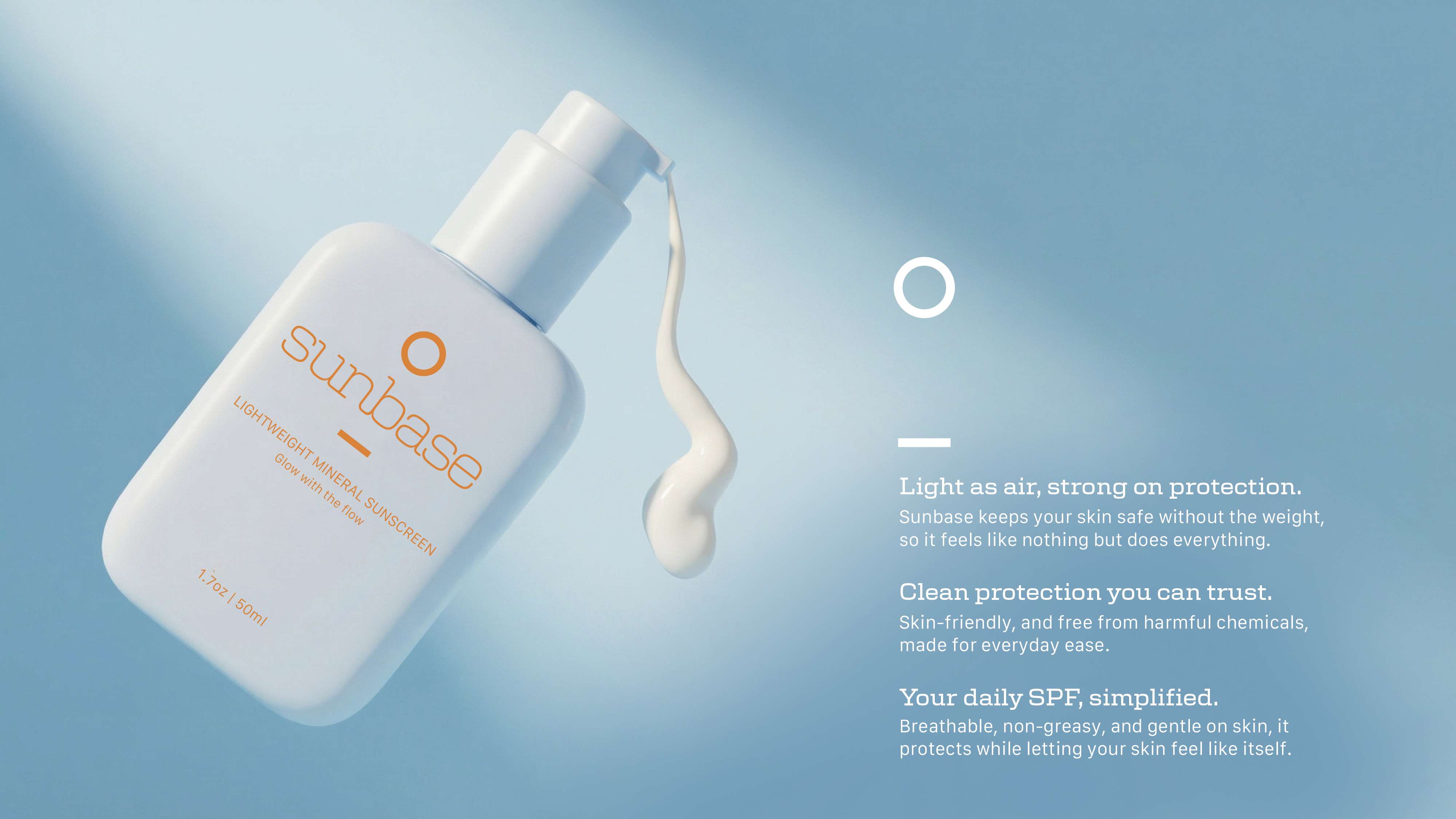
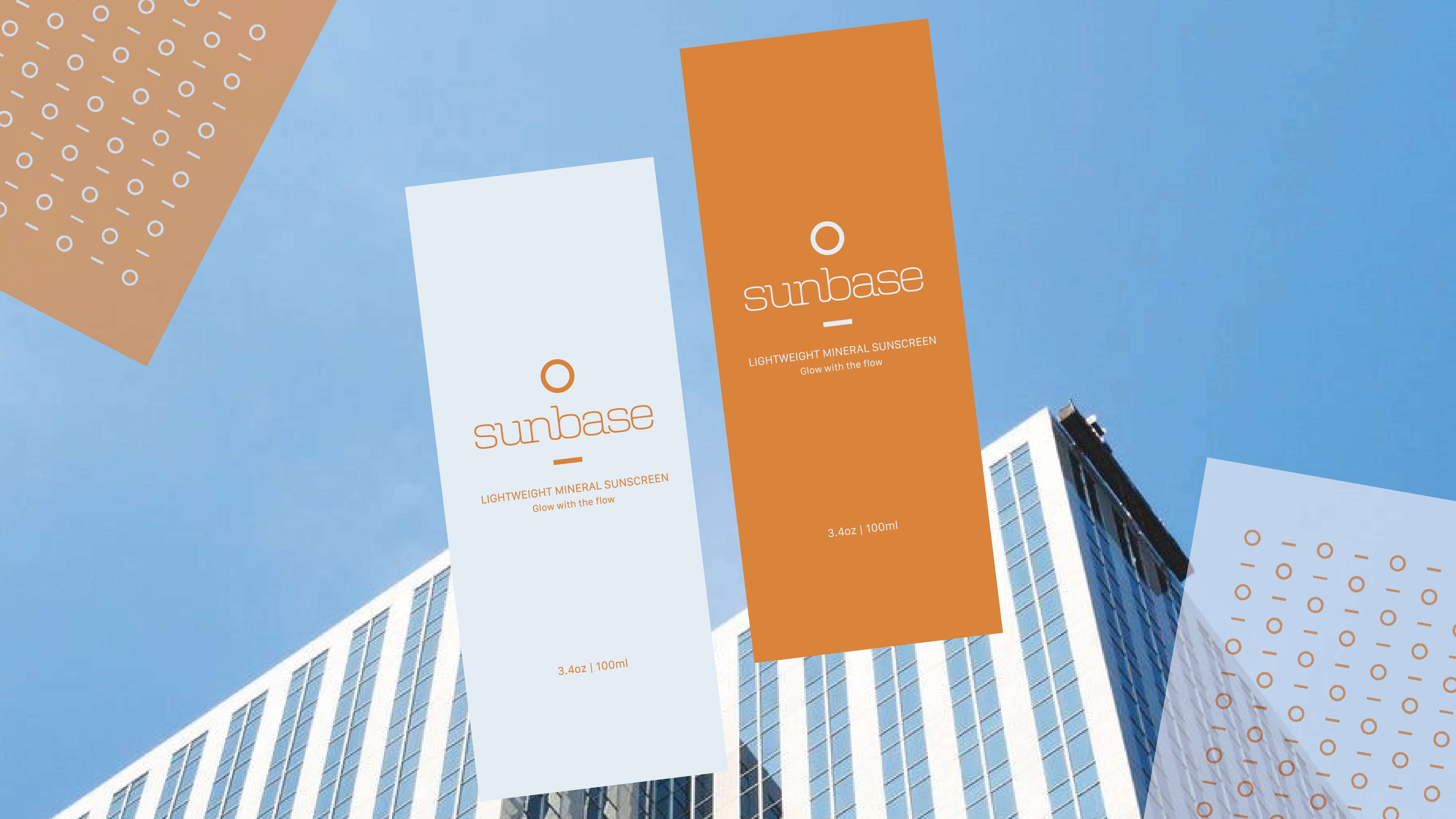
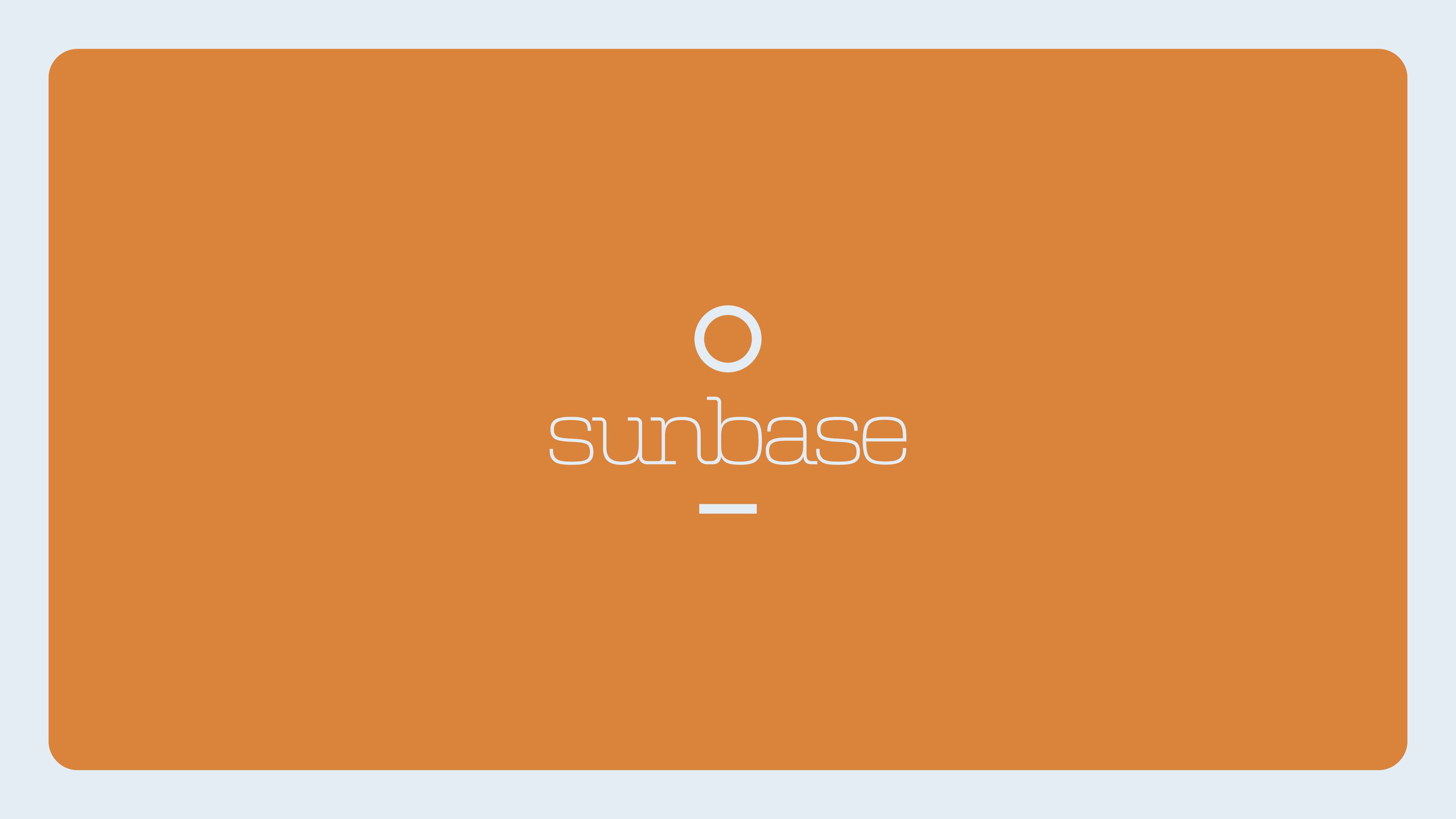
I developed a minimal and modern identity anchored by a custom logotype combining a slab serif with clean, narrow sans serif typography to balance warmth and clarity. A simple circular mark paired with a horizontal line was introduced to represent the sun and horizon, reinforcing the brand name while functioning as a flexible graphic device. This motif was extended into a repeatable pattern system, applied across brand touchpoints such as packaging and merchandise.
The colour palette pairs a pale sky blue with a warm, rust-toned orange to evoke sun and sky while creating strong visual contrast. Product design was approached with soft, rounded forms and pump applicators to emphasise ease of use and tactility. To bring the brand into a contemporary context, I art directed a series of campaign visuals using generative AI tools, developing product mockups and imagery that reflect a clean, high-end yet approachable aesthetic.


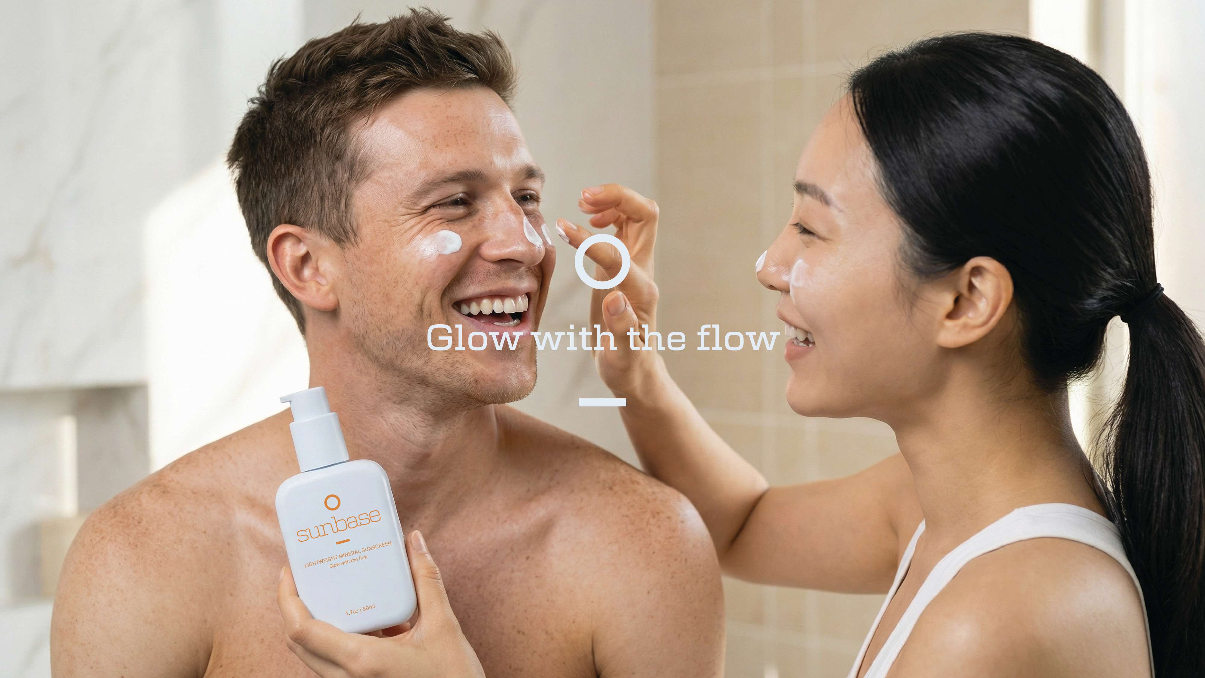
The project demonstrates a cohesive brand system that positions sunscreen as part of a modern daily routine, supported by a consistent visual language across packaging, product, and campaign. It showcases the ability to balance aesthetic refinement with commercial considerations, while integrating emerging tools into the creative process to deliver a fully realised brand world.