
EATMEPOPTART
Illustration – Logo Design – Graphic Design – Motion Graphics Design
EATMEPOPTART, Singapore’s first indie dance music collective, required a continuous stream of event visuals that could capture the energy and irreverence of their brand while remaining fresh and culturally relevant for each event.
Constraints
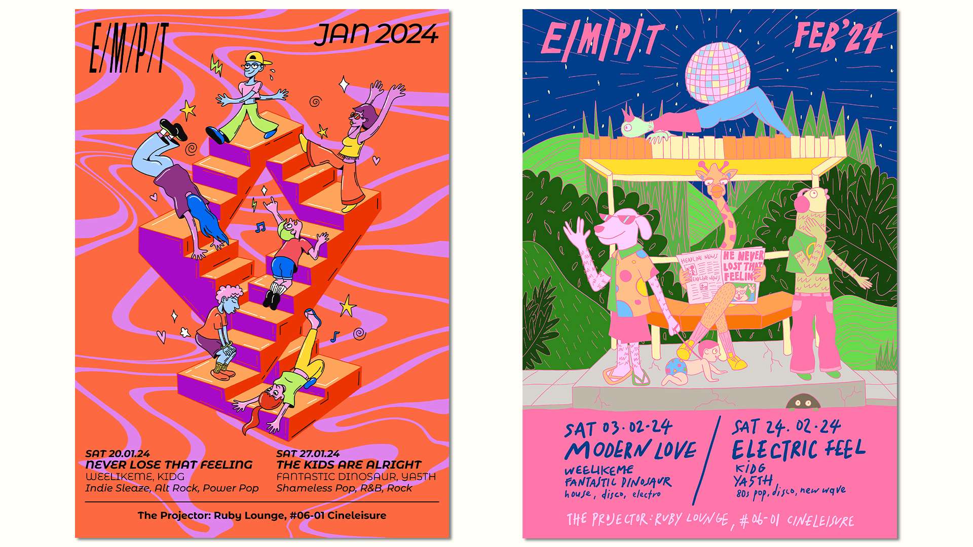
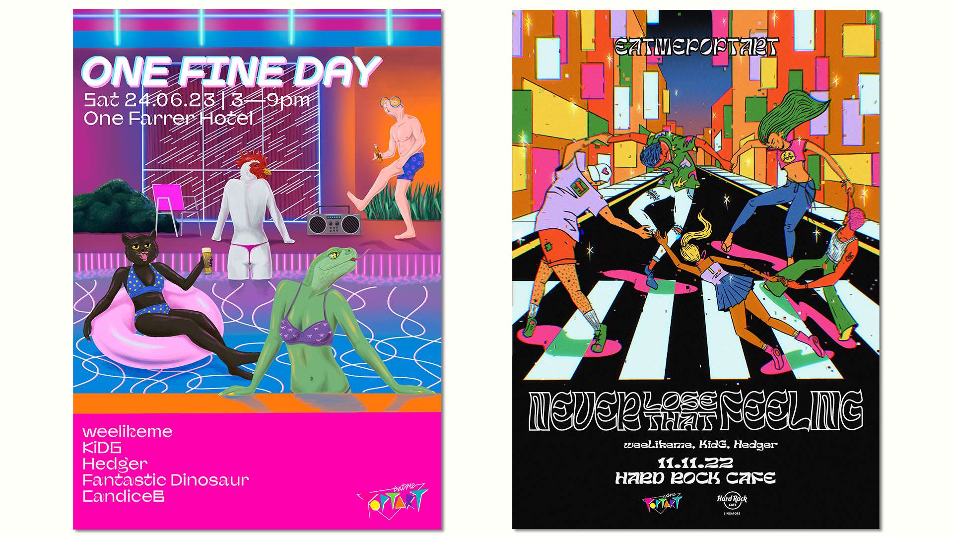
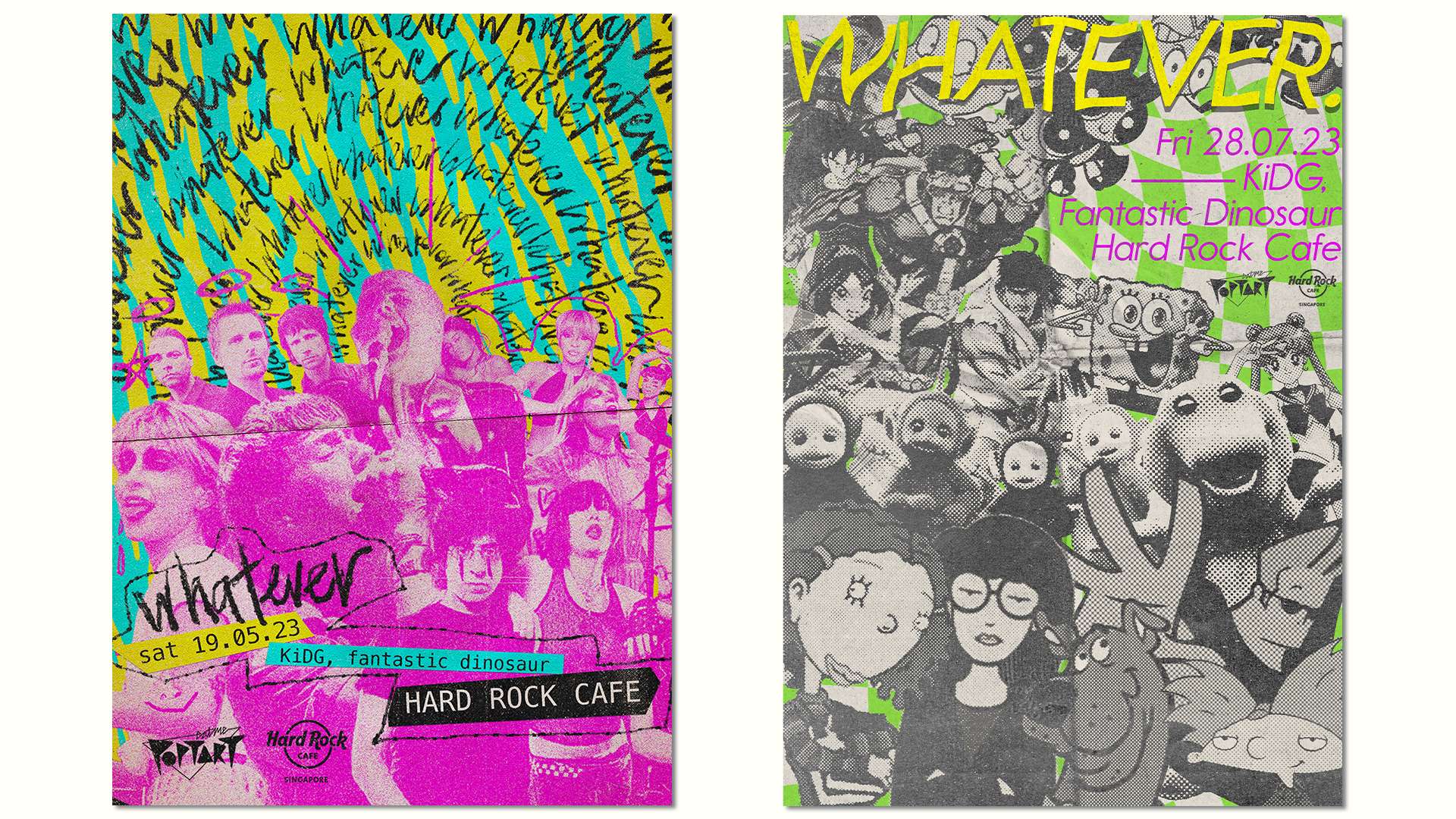
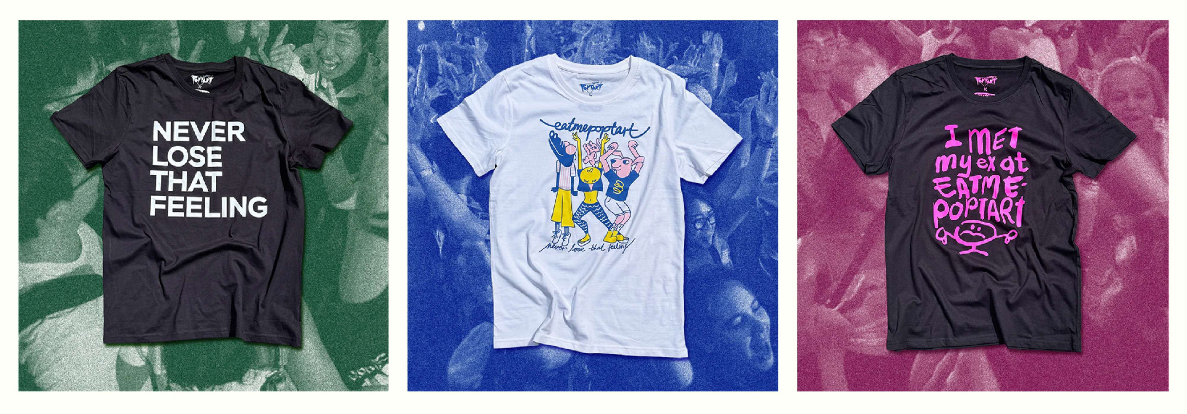
The work operated on fast turnaround timelines—typically within a week—requiring quick conceptual thinking and execution. Each visual needed to respond to a different theme or title while still feeling recognisably “Eatmepoptart.” The outputs also spanned multiple formats, including posters, merchandise, logo variations, and motion graphics for live DJ backdrops, requiring adaptability across both static and moving media.
Decision & Rationale
Rather than applying a fixed visual system, I approached the collaboration as an evolving visual language—using illustration, typography, and graphic experimentation to create distinct yet cohesive outputs. Each piece was concept-led, responding directly to the event’s theme while maintaining the collective’s playful, irreverent tone. The flexibility of this approach allowed for stylistic variation while reinforcing a consistent brand attitude across touchpoints, from promotional posters to live visuals.
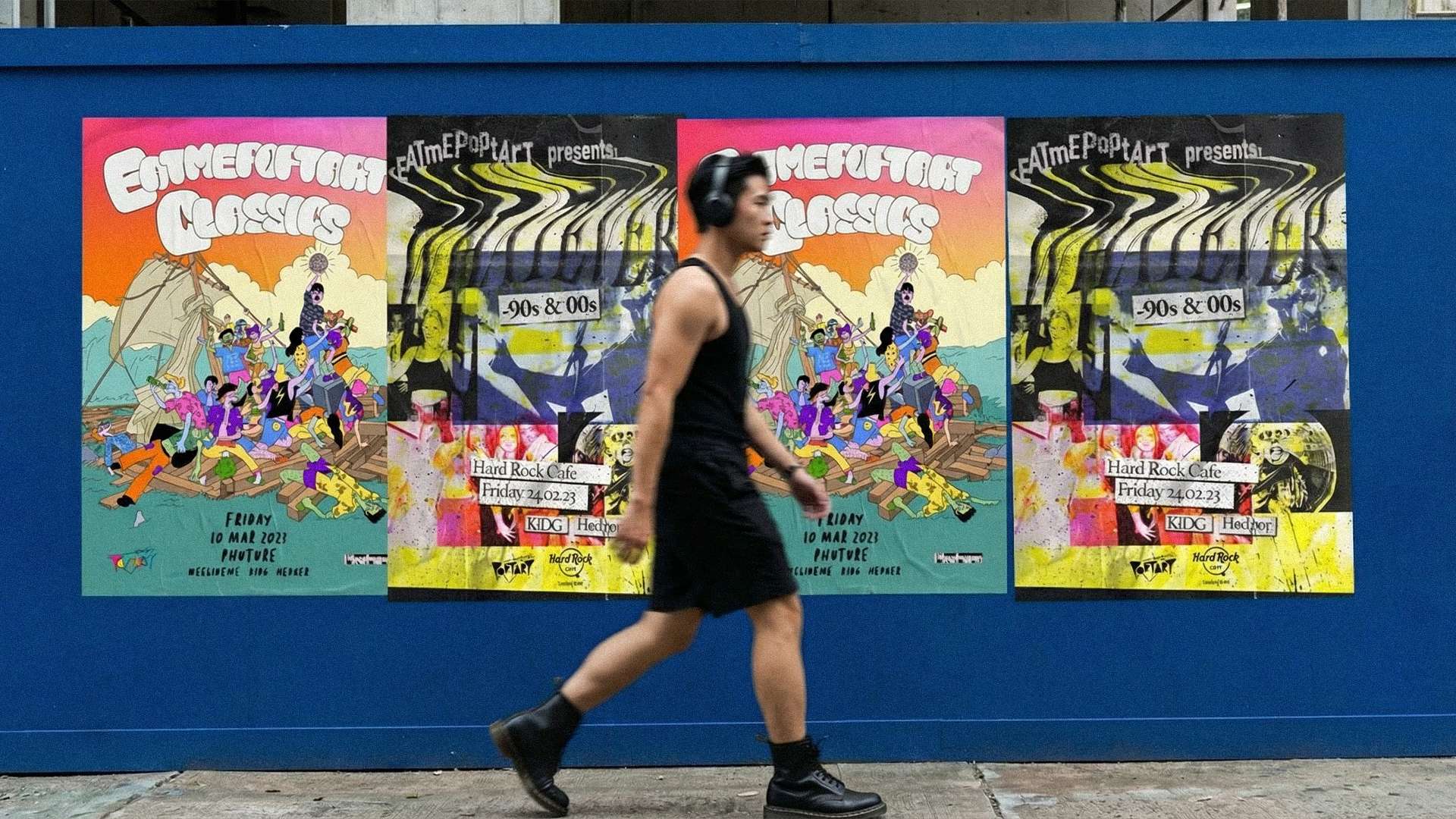
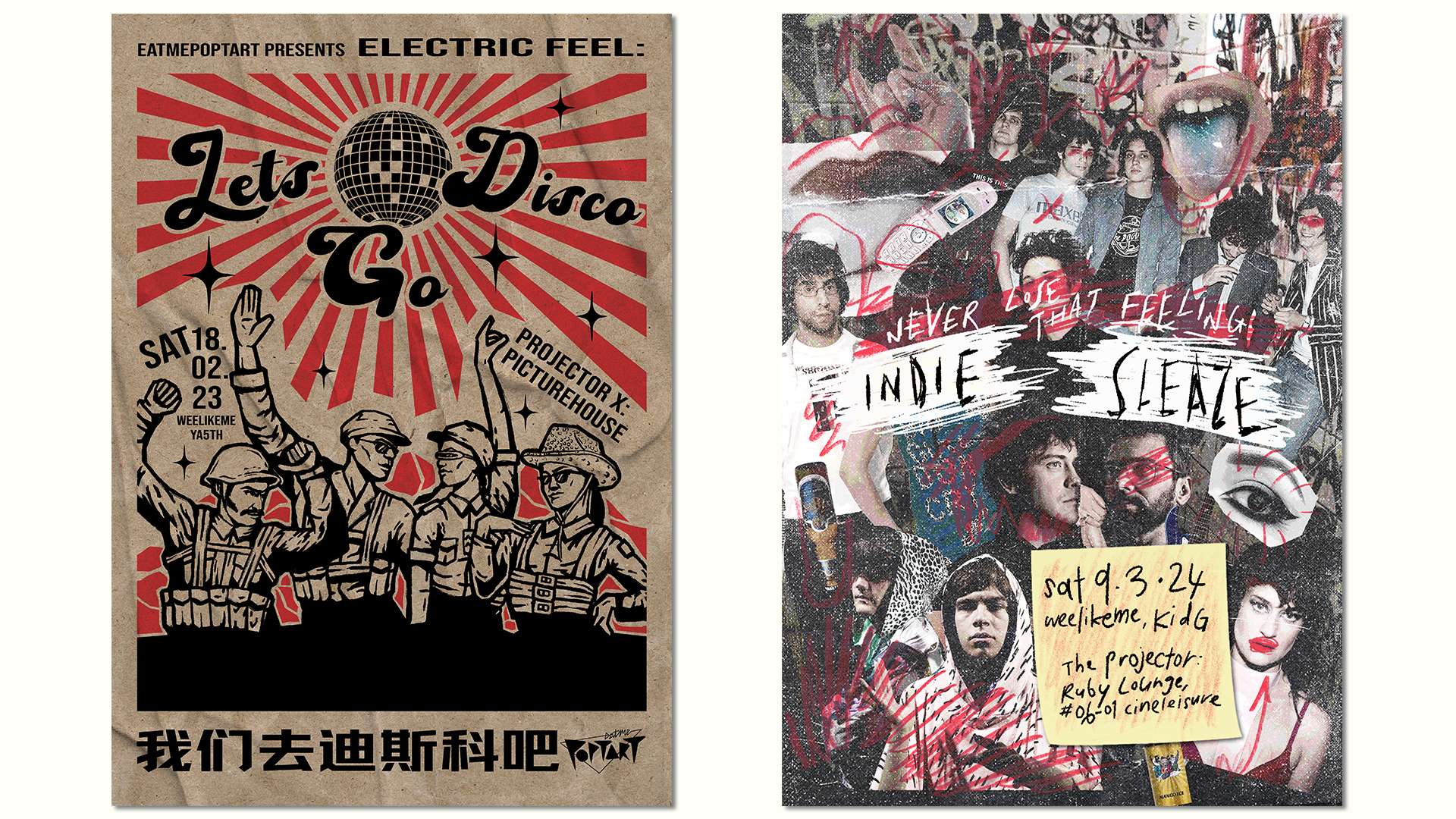


Over three years, the collaboration has produced a large body of work that has become integral to Eatmepoptart’s visual identity. The consistent yet evolving design approach has helped sustain audience engagement and brand recognition across events, both online and in physical spaces, contributing to the collective’s continued relevance within Singapore’s nightlife scene.