Chamber Readings
Graphic Design – Publication Layout
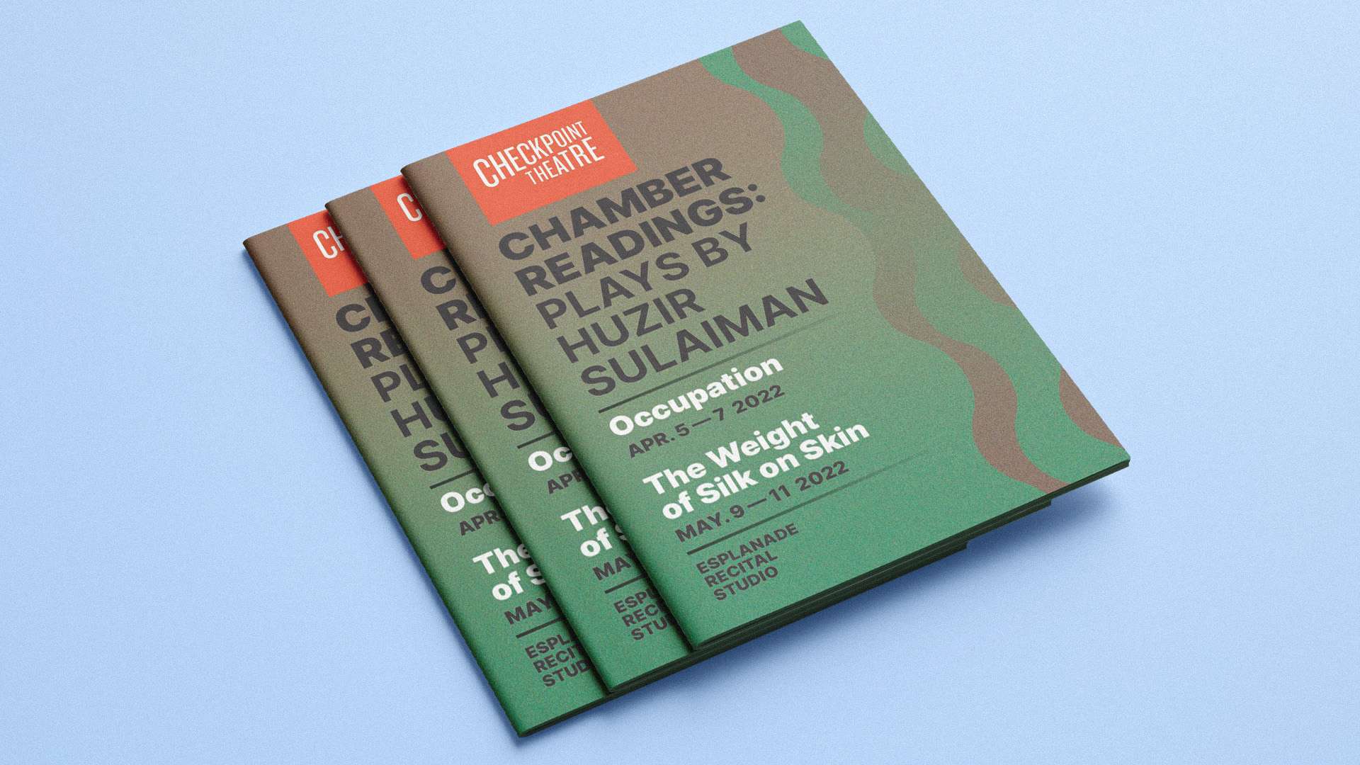
Checkpoint Theatre required a programme booklet for Chamber Readings that would go beyond a conventional text-heavy layout, creating a more visually engaging and concept-driven piece that reflected the tone and content of the plays.
Constraints
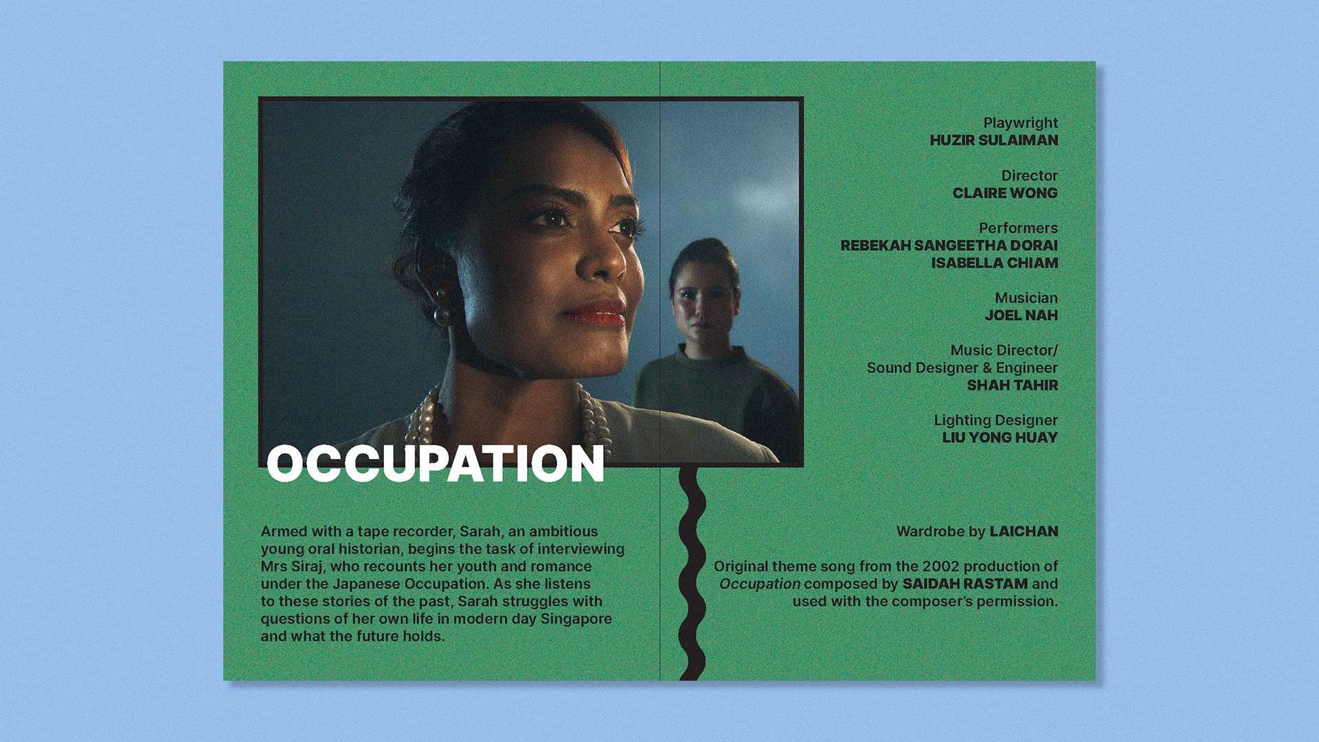
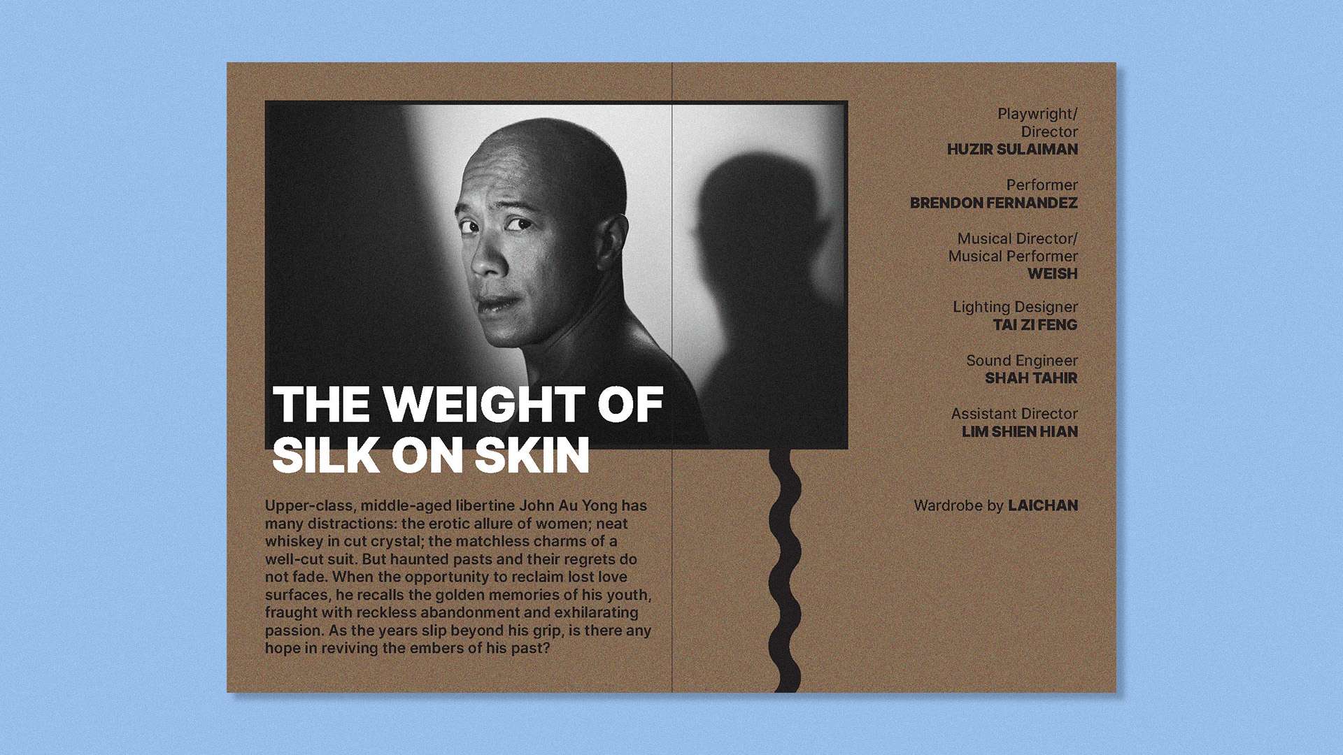
The design needed to work within the functional requirements of a programme booklet—clearly presenting information such as synopses, credits, and schedules—while introducing a stronger visual identity. It also had to resonate with the themes of the productions, which were revivals of past works, balancing a sense of nostalgia with a contemporary presentation.
Decision & Rationale
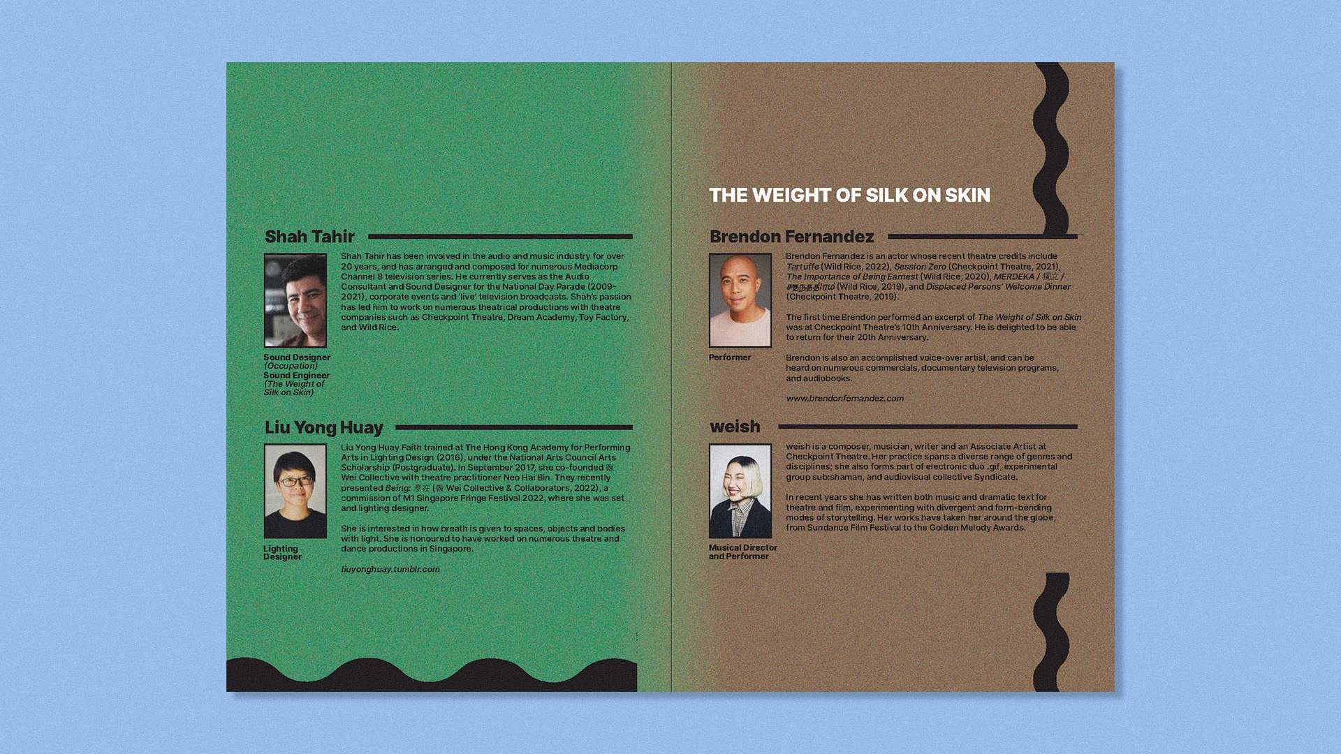
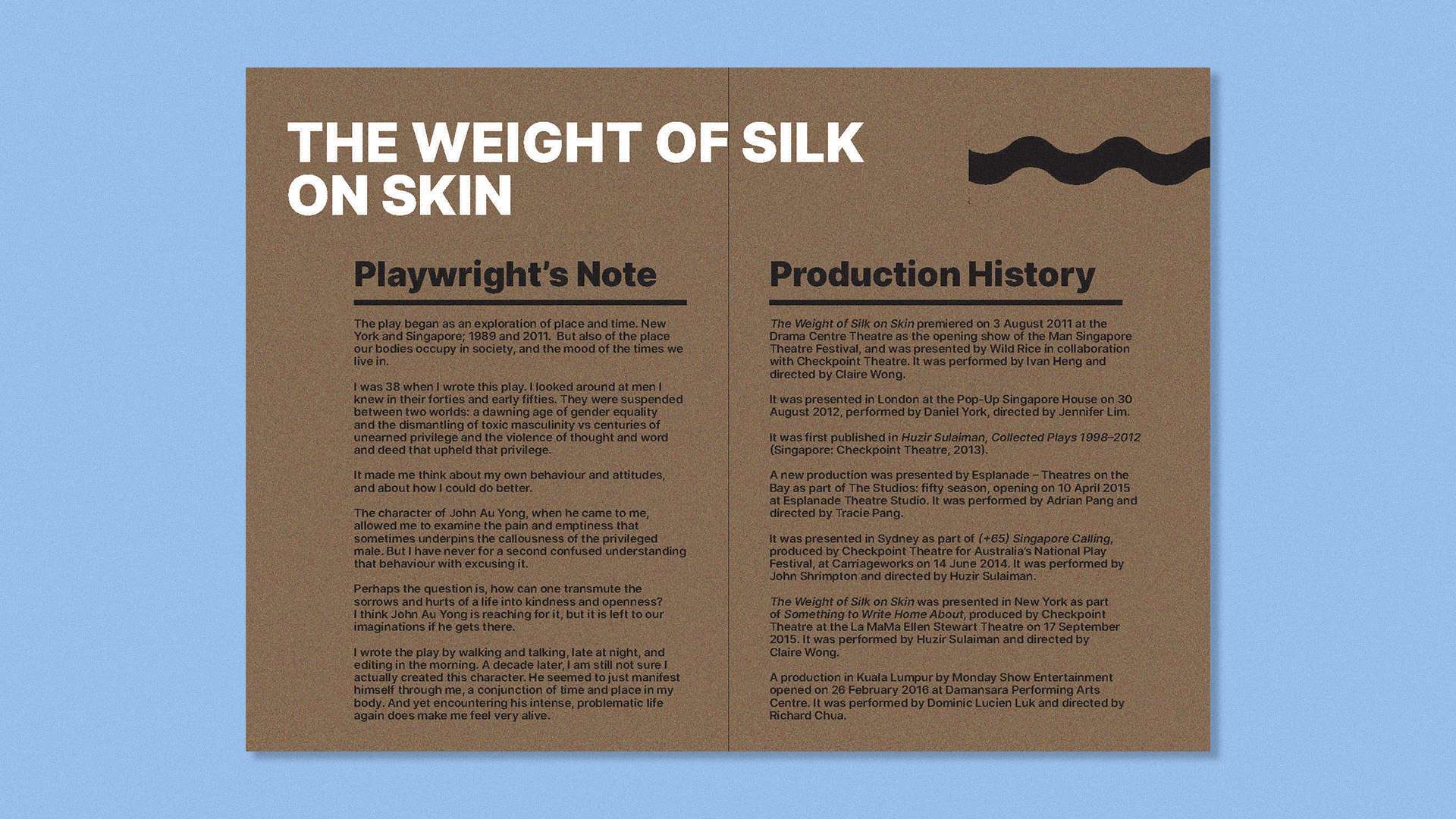
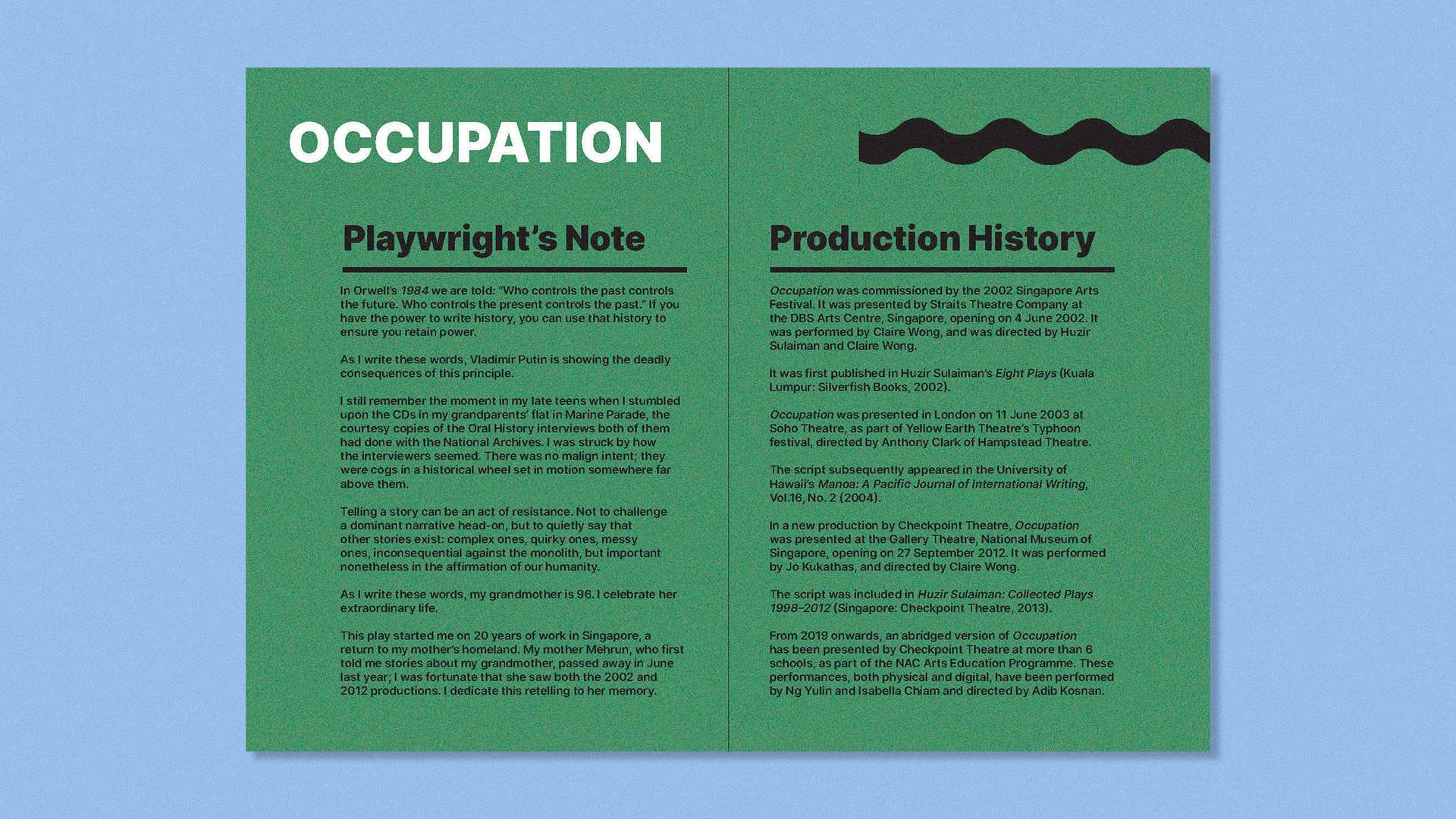
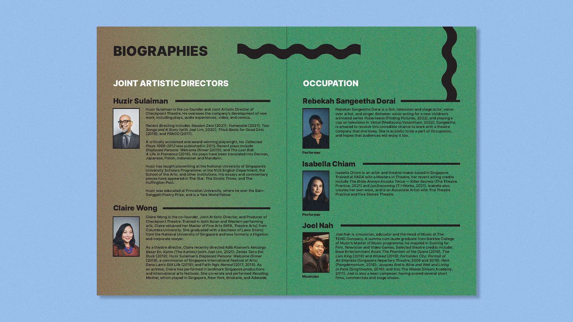
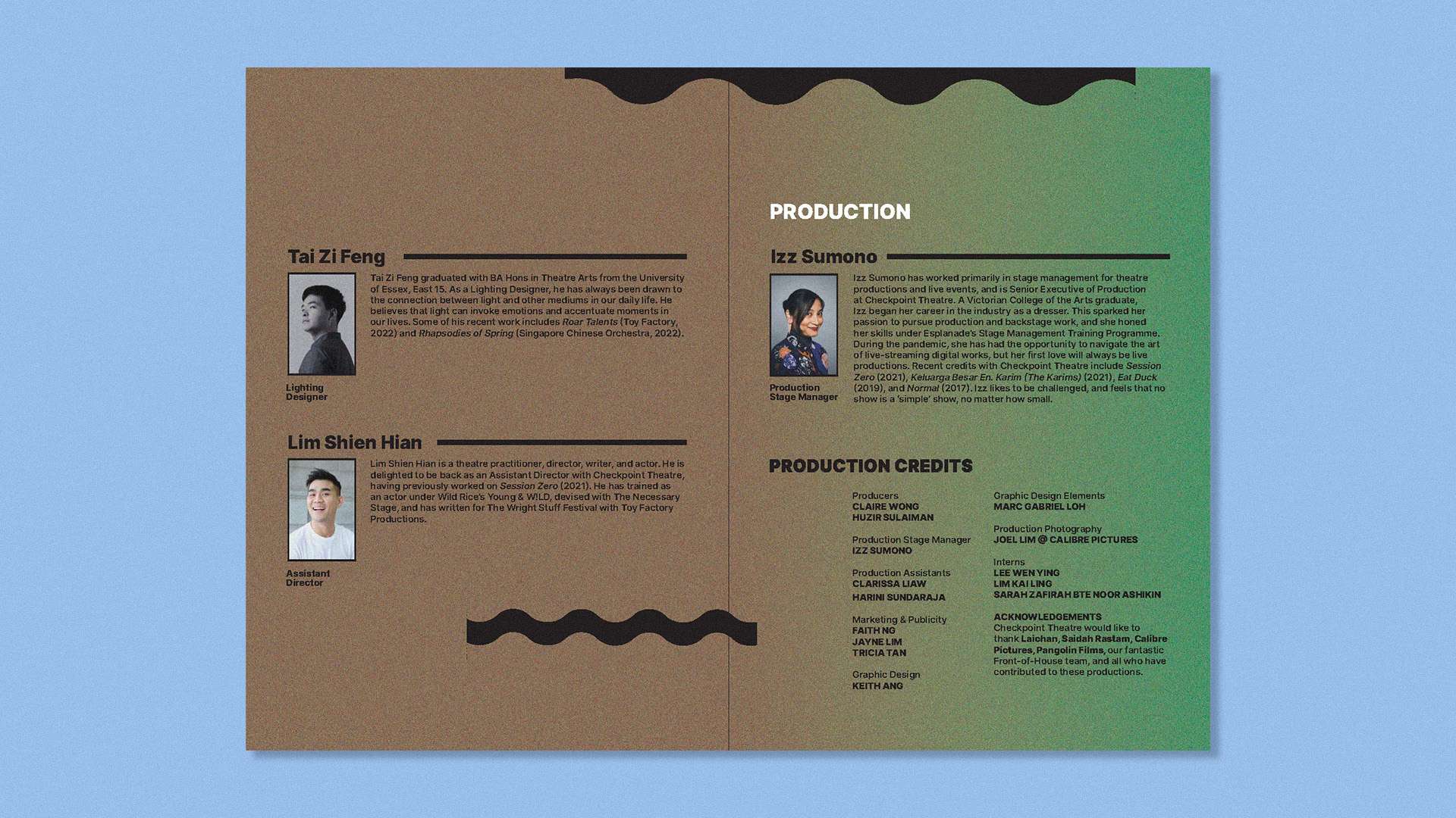
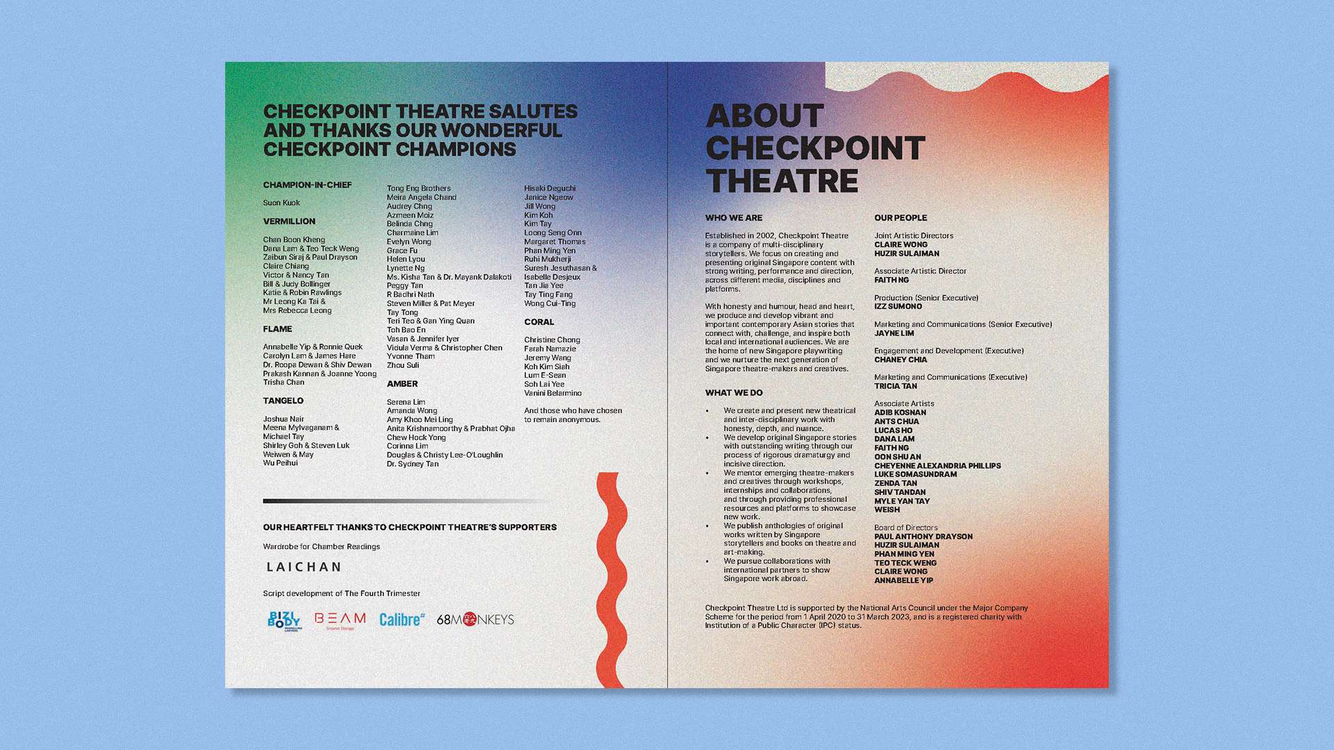
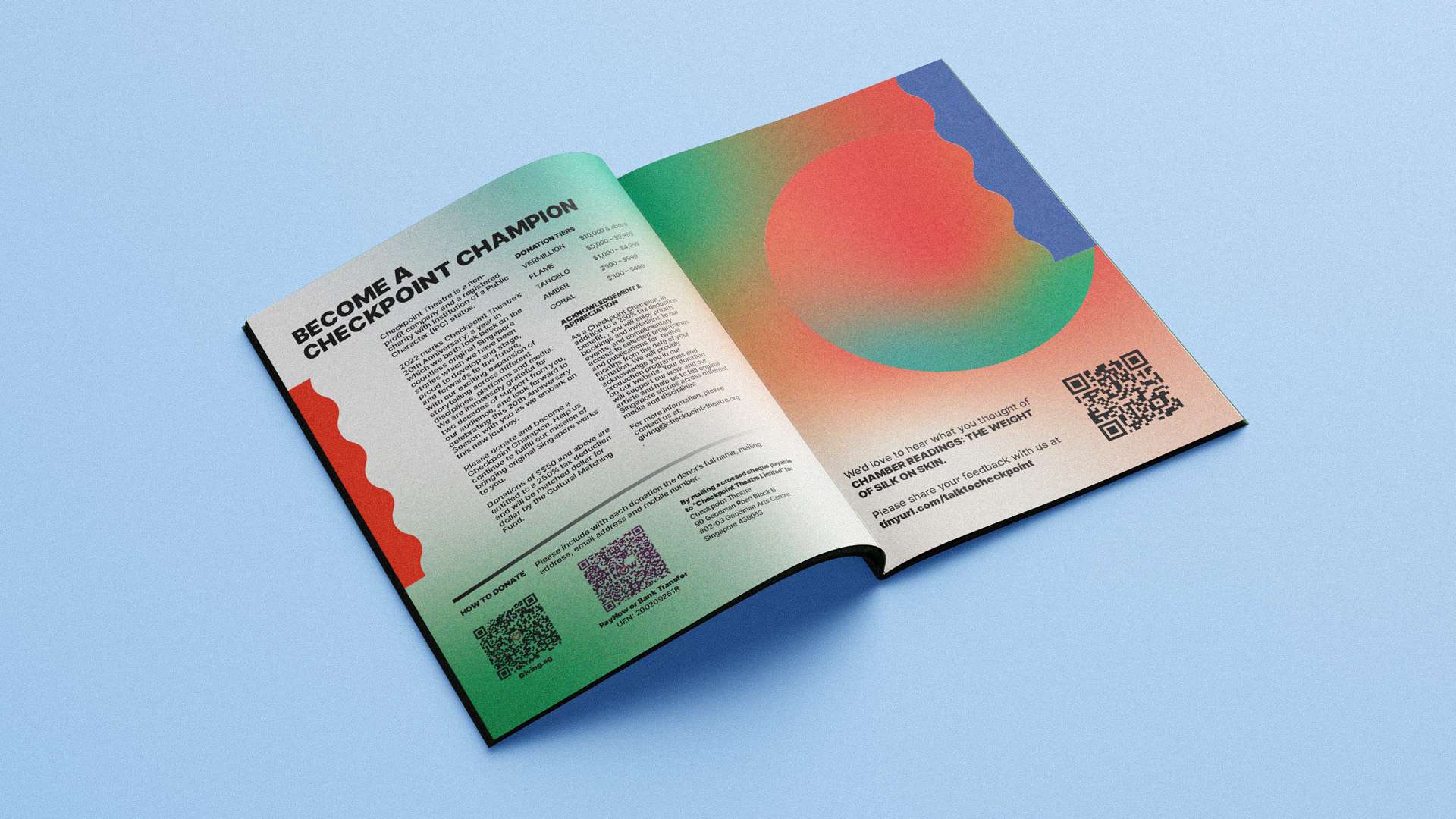
I developed a visual language centred around an earthy colour palette—browns and greens with contrasting accents of orange and blue—to reflect the emotional range of the plays. Simple graphic elements, including wavy lines, gradients, and bold black outlines, were introduced to create rhythm and a sense of theatricality across the pages. To echo the revival nature of the productions, I incorporated subtle noise textures to evoke nostalgia, while keeping the overall composition clean and modern to ensure clarity and readability.
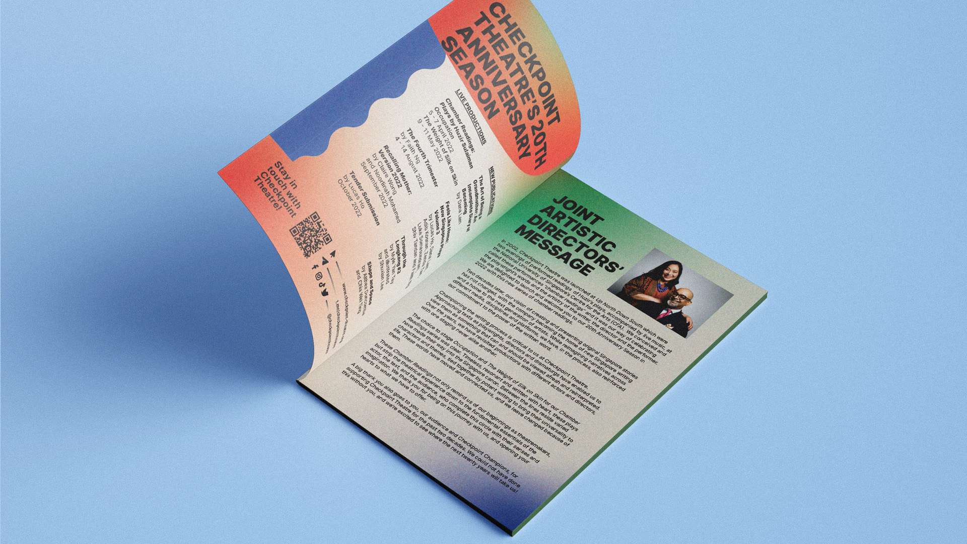
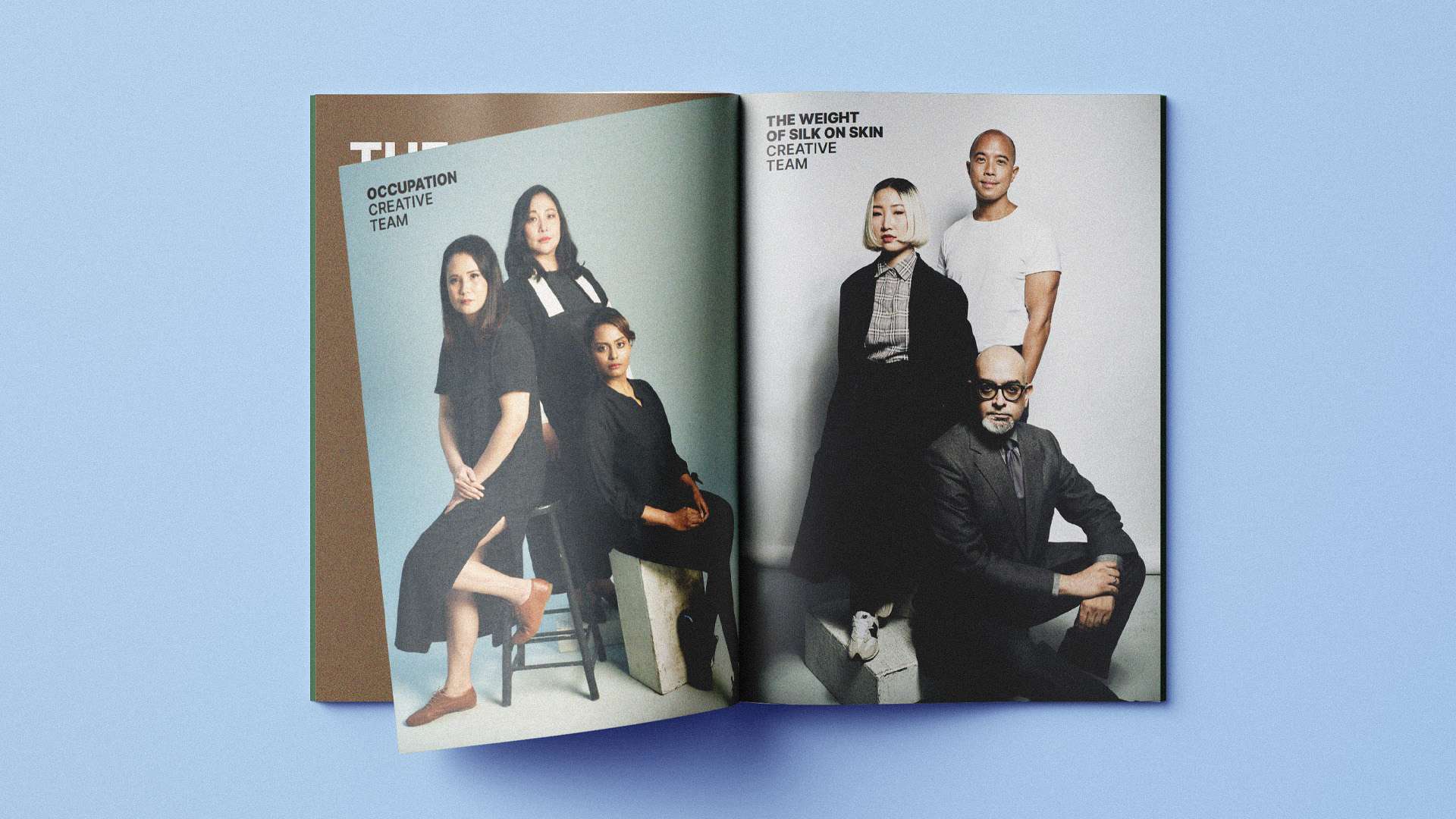
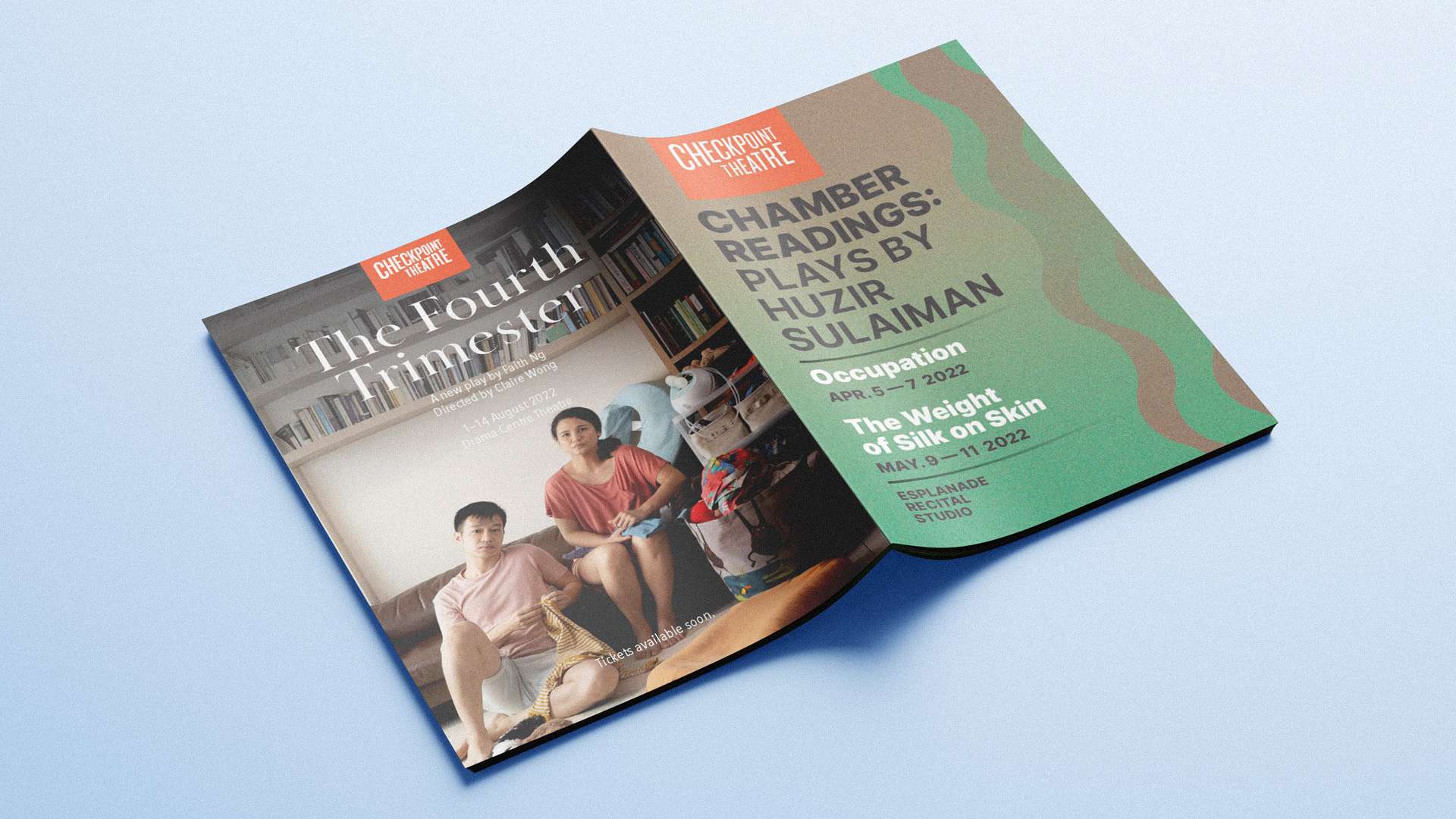
The final booklet elevated the audience’s experience beyond a standard programme, functioning as both an informative guide and a designed artefact that reflected the tone of the performances. It provided Checkpoint Theatre with a more distinctive visual approach to their collateral, reinforcing their identity as a contemporary theatre company engaging with both past and present narratives.