Artful Journeys
Key Visual Design – Branding – Graphic Design
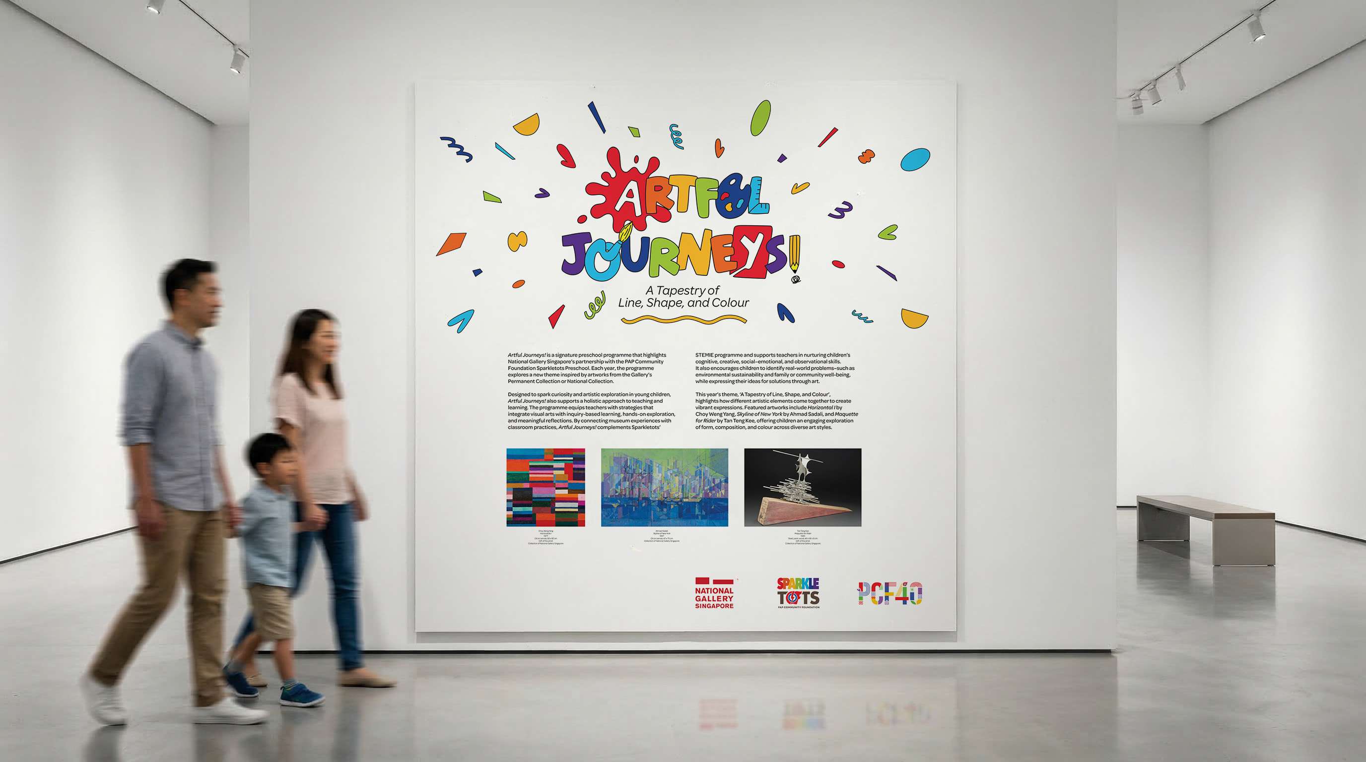
National Gallery Singapore required a key visual for Artful Journeys!, a flagship preschool programme, that could communicate creativity, exploration, and accessibility to young children and educators, while functioning as a long-term identity adaptable across future yearly themes.
Constraints
The visual identity needed to align with existing stakeholder requirements, including the use of PCF Sparkletots’ brand colours, while appealing to a young audience without feeling overly simplistic. It also had to be designed as a scalable system—capable of evolving annually with new themes and extending across multiple touchpoints such as display panels, print materials, and merchandise. The design had to balance institutional credibility with playfulness and clarity for educational contexts.
Decision & Rationale
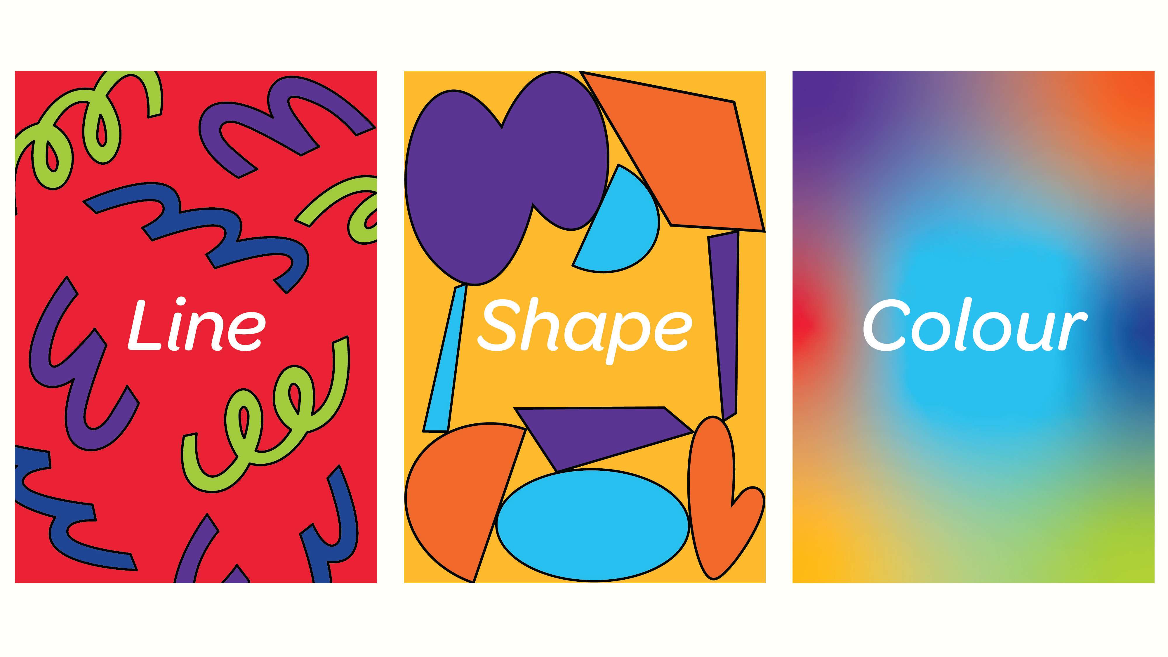
I created a flexible key visual system anchored by a custom logotype with hand-drawn qualities to evoke accessibility and creativity. Subtle art-inspired interventions—such as incorporating a paint palette and brush into letterforms—reinforced the programme’s focus on artistic exploration. To address the need for longevity, the core identity was designed to remain consistent, while allowing for modular elements (such as shapes, lines, and patterns) to be adapted annually in response to each theme. For the launch theme, A Tapestry of Line, Shape and Colour, I introduced dynamic graphic elements radiating from the logo to convey movement, energy, and discovery, while working within the constraints of the prescribed colour palette.

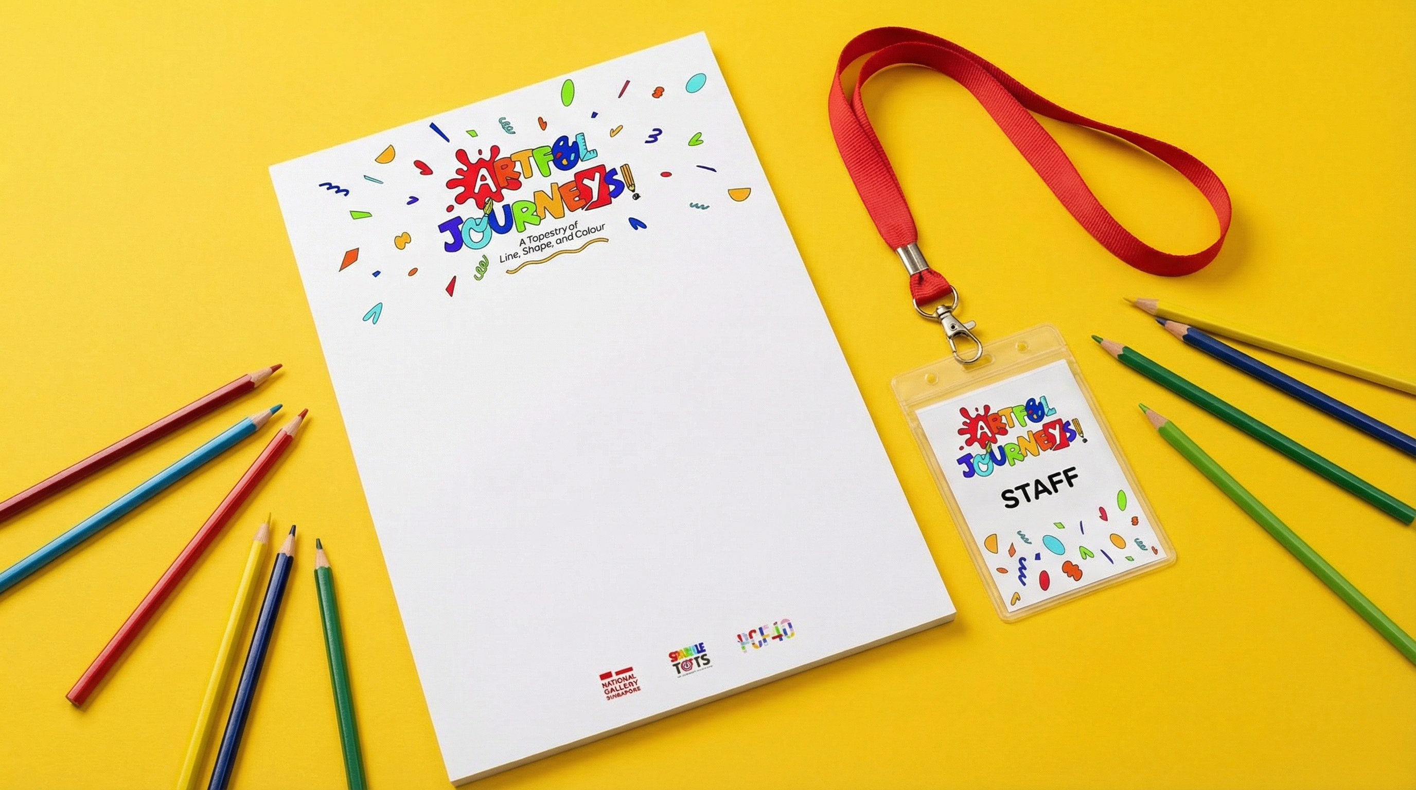
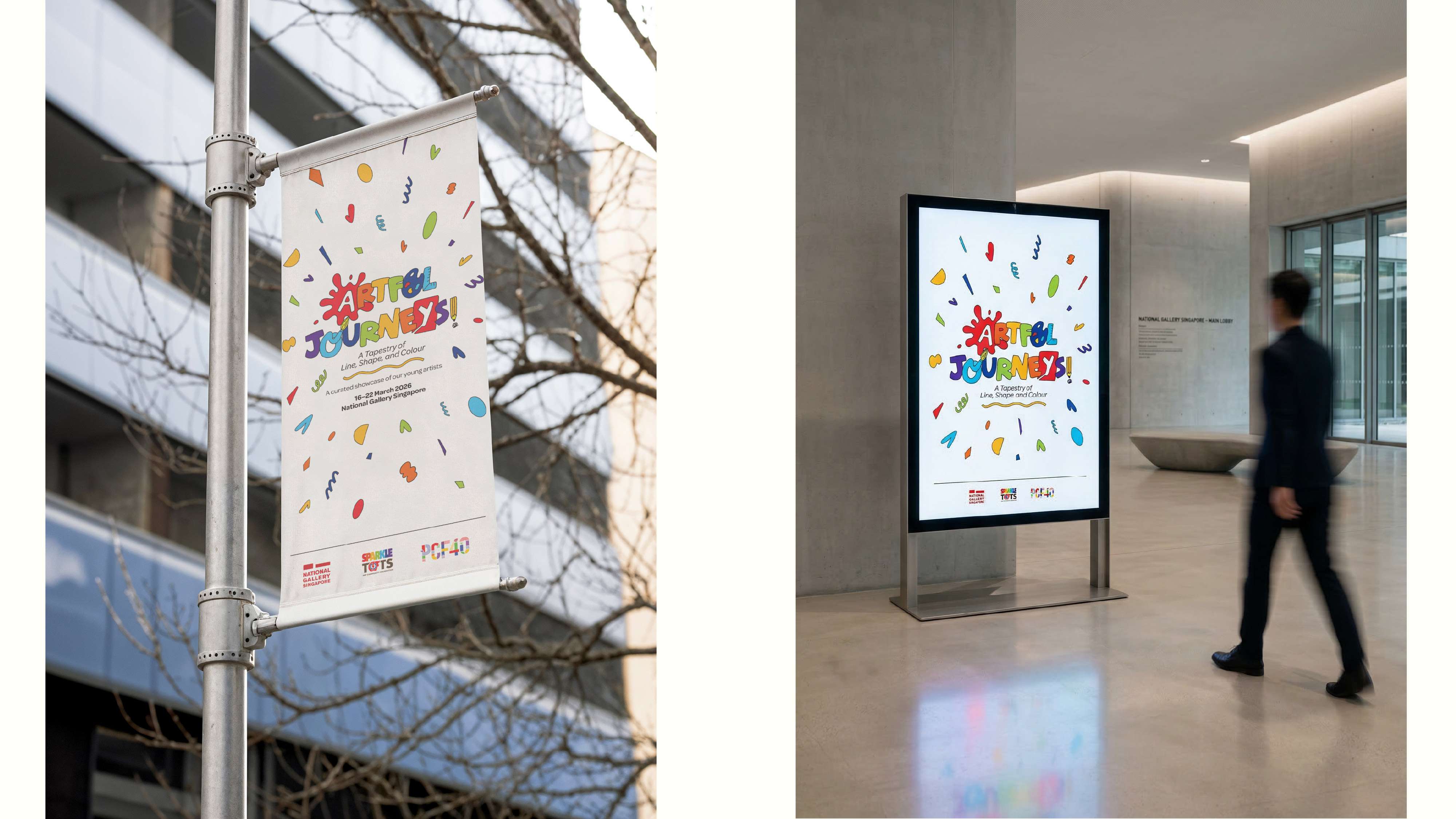


The final key visual was well received by the client and stakeholders, successfully balancing playfulness with a structured system that can be reused and adapted year-on-year. It established a cohesive visual language across programme materials and display panels, supporting the programme’s educational goals while enhancing its visibility and engagement with children, educators, and families.